Welcome to the
Run on Sun Monthly Newsletter

In this Issue: |
October, 2016
Volume: 7 Issue: 10
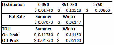
Understanding Tiered vs TOU RatesA client of ours noted that Pasadena Water and Power (PWP) offers, in addition to its regular, Residential tiered rate structure, the option to switch to a Time-of-Use rate structure, and he asked if he would derive additional savings from making that switch. Turns out that is not an easy question to answer, and there certainly isn't a "one size fits all" result. We decided to take a closer look into these rates both for PWP and for the folks in Southern California Edison (SCE) territory. SPOILER ALERT - The following is pretty much down in the weeds. Defining Tiered and Time-of-Use (TOU) RatesLet's start by defining our terms. Most residential electric customers, of both PWP and SCE, are on a tiered rate structure. That means that there are two or more cost steps - called tiers - for the energy that you use. Tiered rates assume that there is some minimally expensive charge for the first allocation of energy per billing cycle, and that as you use more energy your cost for energy increases. For example, SCE's Domestic rate has three tiers and in the first tier the charge is 8.8¢/kWh, in the second tier the charge is 16¢/kWh, but the final tier is 22.4¢/kWh! (There is also a non-tiered component that adds another 6.9¢/kWh to the customer's bill.) PWP, on the other hand, has a somewhat perverse tier structure in that the lowest tier is very cheap, 1.7¢/kWh, the second tier is significantly higher, 13.5¢/kWh, but the final tier actually goes down to just 9.9¢/kWh! Since the whole point of tiered rates is to provide an incentive for heavy users to reduce their usage, PWP is actually rewarding those who consume more than 25 kWh per day with lower rates! Very odd. Time-of-use rates, on the other hand, are generally not tiered. Instead, the day is broken up into segments and the cost of energy varies depending on the segment in which it is consumed. PWP refers to these segments as "On-Peak" (from 3-8 p.m.) and "Off-Peak" (all other hours). But PWP's TOU rate retains the tiered element as well, making it a truly odd hybrid rate structure. SCE's approach is more involved, dividing the day into three, more complicated segments: "On-Peak" (2-8 p.m. weekdays - holidays excluded), "Super Off-Peak" (10 p.m. to 8 a.m. everyday), and "Off-Peak" (all other hours). For both PWP and SCE there is a seasonal overlay on these rates, with energy costs increasing in the summer months (defined as June 1 through September 30). (It is important to note that both PWP's and SCE's TOU rates put the most expensive energy in the late afternoon to evening time period - pricing energy to offset against the "head of the duck." Ultimately, these rates will create the energy storage market in California, but that is a post for another day. Analyzing the Benefits of a Rate Switch - Pre-SolarAssuming that one can create a spreadsheet to model these different rates (not a small task in and of itself!) there is one more hangup - data. Both PWP and SCE report total monthly usage to customers on their tiered rate plans - but in order to analyze your potential bill under a TOU rate, you must have hourly usage data for every day of the year! (Because there are 8,760 hours in a [non-leap] year, such a usage data collection is typically referred to as an 8760 file.) The standard meters that PWP has installed simply do not record that data, so the average PWP customer has no way to know whether they would save money by making the switch. On the other hand, most SCE customers do have access to that data and they can download it from SCE's website.
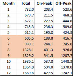
Modeling PWPGiven that PWP doesn't have data available, is there any way to estimate what the results might be? The answer is, sort of. We took an 8760 data set from an SCE customer and used that as our test data for both PWP and SCE. (The data file does not identify the customer.) Since the data file has an entry for every hour of every day, we can segment the usage against the On-Peak and Off-Peak hours, and using a pivot table - probably the most powerful took in Excel - we can summarize those values over the course of the year, as you see in Figure 1.
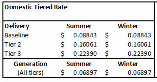
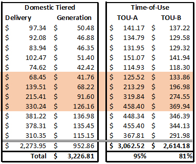
The distribution charge - which applies to both - comes to $1,180 for the year. The flat rate energy charge comes to $893, whereas the TOU charge is $985. Meaning that someone electing to use the TOU rate would have a yearly total of $2,165, whereas the flat rate user would have a total bill of $2,074, making the TOU rate - for this specific energy profile - 4% higher. Beyond that, PWP has a number of other charges - such as a public benefit charge, an underground surtax, and a transmission charge - that are only tied to total usage, so the ultimate difference between these two rates is even smaller. Modeling SCESCE rate structures are significantly more complicated that PWP's. For example, the tier 1 (aka baseline) allocation varies by location. Since SCE covers such a huge and diverse area from cool coastal regions to absolute deserts, customers are allocated more energy per day in their baseline depending upon where they live. In the area around Pasadena that is covered by SCE, a typical daily baseline allowance would be 13.3 kWh in the summer and 10.8 kWh in the non-summer months. The baseline then is that number times the number of days in the billing cycle. Tier 2 applies to every kWh above baseline, but below 200% of baseline. Tier 3 applies to everything beyond that. As with PWP, the tiered rate only applies to "delivery" charges. The energy generation charges are the same all year. Here's what that rate structure looks like:
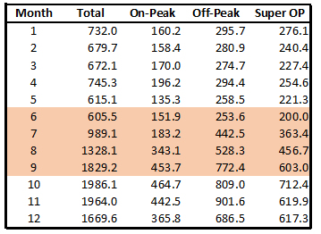
Option A rates run from a low of 13¢/kWh (in summer Super Off-Peak), to 29¢/kWh (during summer Off-Peak) to an eye-popping 44¢/kWh (during summer On-Peak). However, Option A includes a credit of 9.9¢/kWh on the first baseline worth of energy which reduces the monthly bill by roughly $30. Option B deletes that baseline credit and replaces it with a "meter charge" (even though it is the same meter!) of 53.8¢/kWh/day, or roughly $17/month. In return, the On-Peak charges are significantly reduced from 44¢/kWh to just 32¢/kWh.
MAYOR CAVEAT: YOUR MILEAGE WILL VARY! The results displayed here are entirely dependent on your actual energy usage and no two usage profiles are alike. It is possible, even likely, that some usage profiles will see an increase in bills under either TOU option. The good news is, that for a nominal fee, this is an analysis that we could do for any SCE residential customer - we would just need access to your usage data. So that completes our pre-solar analysis. Next month, we will look at how these results change when you add a solar power system into the mix. |
“The same usage that resulted in an annual bill of $2,074 in Pasadena becomes $3,227 once you cross the border into Altadena, South Pasadena, San Marino, or Sierra Madre - an increase of 56%!”
Get your copy of
Commercial Solar:
Step-by-Step
from
Run on Sun
Founder & CEO
Jim Jenal

Now available on Amazon.com
in both
Print & Kindle versions.
Bonus - Buy the Print version…
Get the
Kindle version for Free!
Commercial Solar:
Step-by-Step
from Run on Sun
Founder & CEO
Jim Jenal

Now available on Amazon.com
in both Print & Kindle versions.
Get the Kindle version for Free!
Help Us Spread the News!


We use Angie's List to assess whether we're doing a good job keeping valued clients happy. Please visit AngiesList.com in order to grade our quality of work and client service.
How Green is PWP? Not so much…Pasadena is not only the home for Run on Sun, it is also my home for many years now. Pasadena likes to think of itself as a forward looking, environmentally conscious city. So it was a bit of a blow to see the latest Power Content Label for our home-grown utility, Pasadena Water and Power (PWP), which reveals that when it comes to powering this city sustainably, we still have a long way to go! Under California law, (Senate Bill 1305, Sher, Statutes of 1997), electricity retail suppliers are "required to disclose to consumers which types of resources are used to generate electricity being sold." October 1 is the deadline for utilities to report this info to the California Energy Commission, and they are then required to disclose it to their customers by way of a flier included in the bill. The disclosure is known as a Power Content Label and it breaks down energy sold by source and compares it to the overall mix in the state.
Wow, that's a lot of fossil fuels, with the majority of it coal. Contrast that with the rest of the state where coal is roughly 1/6 of the factor that it is at PWP, and keep in mind that you produce 2.1 pounds of CO2 per kWh when burning coal (on average) compared to just 1.2 pounds from burning natural gas. Worse still, solar makes up 0% of PWP's overall mix, compared to 6% for the state overall. If there is a silver lining in these numbers it is this: 2015 is an improvement over the past. As recently as 2013, coal was a whopping 52% of PWP's total power. So our hometown utility is getting better, but we are a long way from where we need to be! (*Unspecified means "electricity from transactions that are not traceable to specific generation sources.") |
Looking Ahead to the Enphase IQ SystemContact us today to get your own Enphase microinverter solar power system! |
