Welcome to the
Run on Sun Monthly Newsletter

In this Issue: |
January, 2014
Volume: 5 Issue: 1
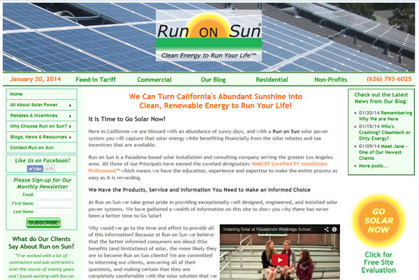
Ch, Ch, Ch, Changes: Rolling out the New RoS Website"Still don't know what I was waiting for…" Well, actually I do. You see, it is a very daunting undertaking to redo a website that you have grown oh, so, comfortable with over the years (yes, years). When some of our strongest supporters started making veiled hints like, "Good grief, when are you going to revise your ugly old website," well, you might start to think that maybe there was a problem. But change is hard. And the old website, it was like family. But a few months ago we reconciled ourselves to a harsh reality—it was time to make a change, and not a minor face-lift but a total redesign, starting from a clean sheet of paper. Then something fascinating happened. As we started planning for the new website, we really got excited about the possibilities. A cleaner look and cleaner code. A modern look and modern functionality. This was not going to be just a "lipstick and rouge" job; this was about taking it down to the foundation, redoing the plumbing and electrical, and re-building to LEED Platinum. So without further ado, let's take a look at some before and after images, shall we? (Or you can cut to the chase and do your own exploring as the new website is now live.) Here is the venerable old home page, RIP.
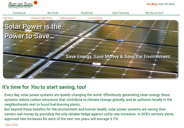
The source code is a bit of a hodgepodge of browser hacks, JavaScript, Spry widgets and a bunch of other stuff that weighs things down. Now here is the new home page:
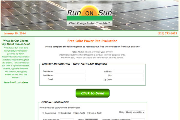
The first thing you notice is that we are using the space quite differently. Gone are the three columns, replaced with a more open, single-column layout. The logo has been trimmed down and the navigation is streamlined. There are five main pages to access from the nav bar (the home page can be returned to by clicking on the logo) and below that are in-page links to help visitors find what is of greatest interest to them on any given page. Beyond that, however, are the much bigger main images that are found on all six of the major pages. Unlike many sites that have images cycling in a never-ending carousel, we eschewed that after reading research that such devices were conversion killers. Instead, we settled for a single image on all pages except the home page, which is treated differently. It gets four different openings, served at random. That gives me the ability to see what strikes the fancy of our visitors and tweak things accordingly. The font is larger and in a new, embedded typeface with the dominant color a rich green. The code is HTML5/CSS3 and all of it validates against W3C. We have pulled out lots of clutter and used jQuery throughout, hopefully to good effect. We have also introduced D3 to the site which has allowed us to do some fun things which you will discover as you explore the site. This is the old sign-up form—every web-based lead that we ever got required someone to fill out this form.
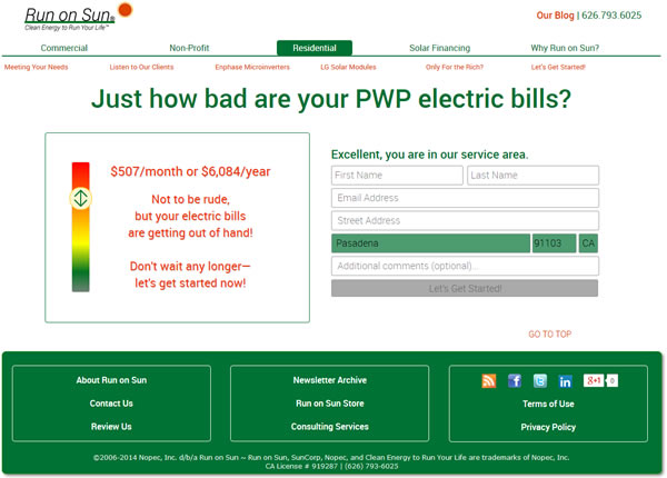
(Odd thing that; it isn't as if it did them any good to submit a form full of junk as no one ever saw it but me. Still, dealing with spammers is a pain...) Here's the new form:
Actually, this form is part of the Residential solar page—there is another one on the Commercial page and a generic one accessible from every other page. If you enter your zip code at the top of the page, it takes you directly to this form and it looks up your zip, figures out if your zip is in our service area, and if so, populates the form with your city and puts the name of the utility in the heading. We've really pared back the number of fields. Every field is required (except for the optional comments) and the button to submit the form is grayed out until you pass our validity checks. While you can get past the validity checks by turning off JavaScript, if you do that, you can never submit the form! Take that, spammers! Over on the left is a widget that lets you adjust a slider up and down to select your monthly electric bill (and get a topical message in return). Finally, at the bottom we've added links to secondary pages on the site, along with a variety of social media related links and our copyright notice. I could go on, but I would much rather you "turn to face the strain," go exploring and see what you think. And of course, I would love to hear your reactions. But be kind… this is family now! |
“A few months ago we reconciled ourselves to a harsh reality—it was time to make a change, and not a minor face-lift but a total redesign of our website, starting from a clean sheet of paper…”
Get your copy of
Commercial Solar:
Step-by-Step
from
Run on Sun
Founder & CEO
Jim Jenal

Now available on Amazon.com
in both
Print & Kindle versions.
Bonus - Buy the Print version…
Get the
Kindle version for Free!
Commercial Solar:
Step-by-Step
from Run on Sun
Founder & CEO
Jim Jenal

Now available on Amazon.com
in both Print & Kindle versions.
Get the Kindle version for Free!
Help Us Spread the News!


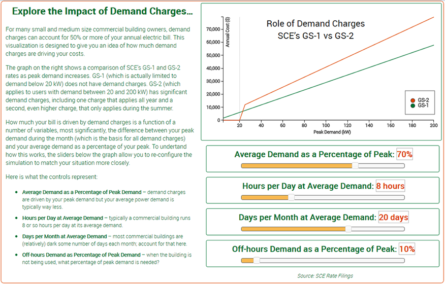
Comparing SCE Rates for Commercial UsersSCE has two rate structures commonly used by commercial customers: GS-1 and GS-2. As part of our new website roll-out, we have been exploring the use of interactive data visualizations and we decided to create one to explore the impact of demand charges under SCE's commercial rates. Here's some background. SCE's smallest commercial customers, those whose peak power demand is 20 kW or less, are assigned to the GS-1 rate. This is a rate structure very similar to what one has at home - charges are based on the total amount of energy used in a month (as measured in kWh). Moreover, this is a flat rate structure - every kWh costs the same, and does not account for when it is consumed. (NB: this is changing; over the next year SCE's commercial customers will be moved to a time-of-use rate structure, but for now, most are not. We will have more to say about SCE's commercial time-of-use rates later.) The GS-2 rate structure, on the other hand, includes all commercial customers with peak power demand between 20 and 200 kW - a very large segment of the commercial customer base. For them, an additional rate component is introduced - peak power charges, better known as demand charges. While GS-2 customers pay significantly less per kWh of usage, they more than make up for it in demand charges. Indeed, during the summer months, GS-2 customers pay for demand charges twice! The net effect of all this is that GS-2 customers generally pay significantly higher bills than they would if their rate was based on usage alone. To explore that, we created this visualization. Derived from the actual rate tariffs (which are linked to on the site), this allows you to compare what your annual bill differential would be against a variety of scenarios. Since most commercial customers have a peak demand significantly higher than their average, that is the first "knob" to adjust - as average demand becomes a smaller percentage of peak, the differential increases. To try this for yourself, click on the image above to go to the visualization page. We would love to hear your thoughts about this tool, as well as SCE's commercial rates. |
Petition to Protect Solar RightsAlas, that result was a decidedly mixed blessing, as departing Commissioner Ferron recently noted:
Which brings us back to the petition campaign over at Vote Solar. Here's the petition text in full:
We believe that the CPUC needs to hear from as many Californians in support of solar as possible. Trust me, they are already hearing plenty from the lobbyists for SCE, PG&E and SDG&E. Please take a moment to add your name in support of rooftop solar by signing Vote Solar's petition. |
