Category: "SCE"
04/10/13
Categories: Solar News, SCE/CSI Rebates, SCE, NABCEP, Commercial Solar, Residential Solar, SDG&E
Picking a Commercial Solar Contractor: NICELY Does It!
Before you can ever get a bid for your commercial solar project, you have to contact a solar installation contractor to come out to your location and perform a site evaluation. Actually, you should contact at least three contractors so that you have a set of bids to compare (more on that process below) - but how do you find them in the first place? Well, you could choose based on who has the most ads on TV or the Internet, or you could rely on Cousin Billy’s recommendation - but somehow that just doesn’t seem sufficiently scientific for a project like this. There has to be a better way - and there is.
If you remember that you need to find someone who will work NICELY with you, success is all but assured. And no, we don’t mean nicely, we mean NICELY - as in:
N - NABCEP Certification
I - Incentive provider (CSI or local utility) connected
C - City building department experienced
E - Electrician on staff
L - Local or national?
Y - Years in business.
Focus on those attributes and you will have found a contractor who will inspire confidence and guarantee a successful project. Let’s expand on why these particular attributes are so important.
NABCEP Certification
 The North American Board of Certified Energy Practitioners - NABCEP for short - provides the most rigorous certification process of solar installation professionals in the industry. Not to be confused with their Entry Level Letter that merely demonstrates that the person has taken an introductory course in solar, the NABCEP Certified Solar PV Installer™ credential is the Gold Standard for installers and consumers alike. Earning NABCEP Certification requires the successful candidate to have an educational background in electrical engineering or related technical areas (such as an IBEW union apprenticeship program), at least two solar installations as the lead installer, and the successful passing of a 4-hour written examination on all aspects of solar power system design and installation.
As NABCEP notes:
When you hire a contractor with NABCEP Certified Installers leading the crew, you can be confident that you are getting the job done by solar professionals who have the “know-how” that you need. They are part of a select group of people who have distinguished themselves by being awarded NABCEP Certified Installer credentials.
NABCEP’s website offers a database of all Certified Solar PV Installers - just enter your zip code to find the installers located near you. It is with great pride that we point out that at Run on Sun, all three of our owners have earned the designation, NABCEP Certified Solar PV Installer™ - and we know of no other solar power company in Southern California that can make that claim.
Incentive Provider - CSI or Local Utility
A second source of solar installers is the Incentive provider such as the California Solar Initiatives’ Go Solar California website. Every installer who has done a solar power installation for a CSI utility (i.e., SCE, PG&E or SDG&E) will be included on this list. Unfortunately, there are no other criteria associated with getting listed - and there is limited verification done to guarantee that the listed installer is reliable. If your job is in California, your contractor must be on this list - but this is a double-check only - not an ideal starting point for your search.
Another source for information about solar installers is your local utility’s point person for solar rebates. This person deals with installers on a daily basis, and while s/he won’t give you a specific recommendation, they may be able to warn you off of an installer whom they have learned is less than reliable.
City Building Department
Similarly, the folks in your local building department deal with installers regularly as part of the permitting/inspection process. Once again, they won’t be in a position to provide referrals, but they may be able to give you a warning if there are red flags associated with a contractor that you are considering.
Local or National?
Solar installation companies come in all sizes - from national organizations that have crews installing systems all across the country, to local operations that only work in a limited geographic region. To be sure, there are pluses and minuses on both ends — maybe lower prices for the national chain due to economy of scale in their purchasing versus greater attention to detail from a local company that lives or dies based on how well it satisfies its local customer base. And, of course, money spent on a local company tends to stay in the local economy - another consideration in tough economic times.
Years in Business
The last of the NICELY elements is to look at the number of years the company has been in business. Again, this is not a perfect indicator – some recent ventures really have their act together and some long-standing enterprises have long since ceased to really care about what they are doing – but at a minimum you want some assurance that the folks you are doing business with know how to run a business. Otherwise you run the risk of having a largely useless warranty and no one to call if things go wrong.
We would recommend a minimum of three-to-five years in the business of doing solar, with preferably a longer track record of running a business. Expertise in areas beyond just installing solar is also useful such as engineering, management and law.
The preceding is an excerpt from Jim Jenal’s upcoming book, “Commercial Solar Step-by-Step,” due out in July.
08/24/12
Categories: All About Solar Power, Solar Economics, SCE/CSI Rebates, SCE, 2012
State of SoCal Solar 2012 - Part 1: Overview
UPDATE - Read Part 2 of our series here: Who’s Hot and Who’s Not?
One year ago we wrote a three-part series analyzing six months worth of CSI data that turned out to be our most read blog posts ever. So back by popular demand, here is our analysis of the first half of 2012 CSI data in the SCE service area.
Methodology
First a brief review of our methodology. We started by downloading the Working CSI data set dated August 22, 2012. (Here’s a link to the CSI Working Data download page, and here’s a link to the data set (8MB zip file) that we used for our analysis.) As we did a year ago, we limited our analysis to just the data from the SCE service area. To limit our time period to the first half of 2012 (equivalent of what we did last year), we took the latest of a series of milestone dates in the CSI data (from First Reservation Date to First Completed Date) and used that as our Status Date and limited that date to values from 1/1/2012 to 6/30/2012. Collectively, that accounted for 9,669 projects, an increase of 53% over the same period last year!
So that we can compare apples to apples, our analysis uses CSI AC Watts as the measure of system size (except where noted) instead of the more commonly reported DC or Nameplate Watts. Why did we do that? Well, not all 5kW Nameplate Watts systems are the same. Some systems use less efficient inverters whereas others have panels that have very poor temperature performance (as indicated by their PTC rating), and some sites are poorly oriented or have substantial shading. CSI AC Watts values take all of those factors into consideration - thereby giving a truer measure of the system’s actual performance.
Overview
Apart from the dramatic jump in the number of projects over the same period last year, how does the overall data for the first half of 2012 compare to that data from last year? Here’s what we found:
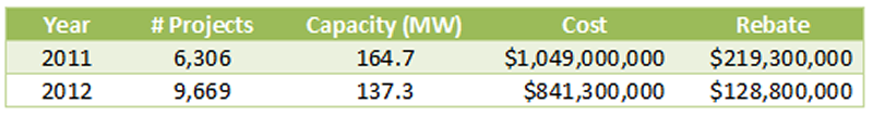
Even though the number of projects increased dramatically from the same time period last year, the potential installed capacity of the projects declined significantly. This may well reflect the expiration of the federal 1603 Treasury Grant program as it became harder to finance new commercial projects after the first of the year. Here’s how the averages changed from 2011 to 2012:
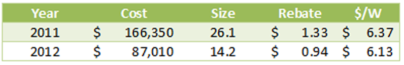
The average system size in the 2012 data dropped 46% from the same period in 2011. Likewise, rebate expenditures per Watt fell from $1.33 to $0.94, or 29%. At the same time, the system cost per Watt also declined, but far less dramatically, from $6.37 to $6.13/Watt. We will have more to say about system costs later.
Altogether, the data reflects a total of 519 different solar contractors, of which 213 (41%) were responsible for only one project.
Delisted by Design?
One intriguing item we noted last year was the significant number of projects - a full 11% - that were categorized as “delisted” meaning that they had been cancelled for one reason or another. How did that number fare in our new data? It dropped significantly down to just 4.2% of all projects, 6.3% of the potential installed capacity.
Of course, projects can be cancelled for a host of reasons. Nevertheless, we decided to see if there were any companies that jumped out as having an unusually high rate of delisted projects. We listed all of the companies that had any projects flagged as delisted (a total of 113 different companies) and compared that to their total number of projects. We extracted those companies that had ten or more delisted projects and rank ordered them by the percentage of all projects that were delisted.
Here’s what we found:
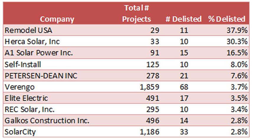
Holy smokes, what is going on here? Either Remodel USA, Herca Solar and A1 Solar Power are really unlucky, or something about how they create projects would seem to be problematic. We will have more to say on this point in a subsequent post in this series.
Oh and a note to Do-It-Yourself’ers - you have a one in twelve chance of not completing your solar project. Maybe solar really is something better left to the pros!
Is Bigger Still Better? (Or at least Cheaper?)
We closed Part 1 last year by looking at how the size of a system drives down the cost, and we wondered if the same would hold true this year? To find out, we excluded delisted projects from our data and divided the remaining projects based on system size with one category being systems below 10kW and the other being between 10kW and 1MW. (Strangely, we had to exclude some real outliers from our “small” system category - can you believe it, we found systems priced at over $30/Watt? Again, much more to say about that in a subsequent post.)
Here’s our results for the small system category:
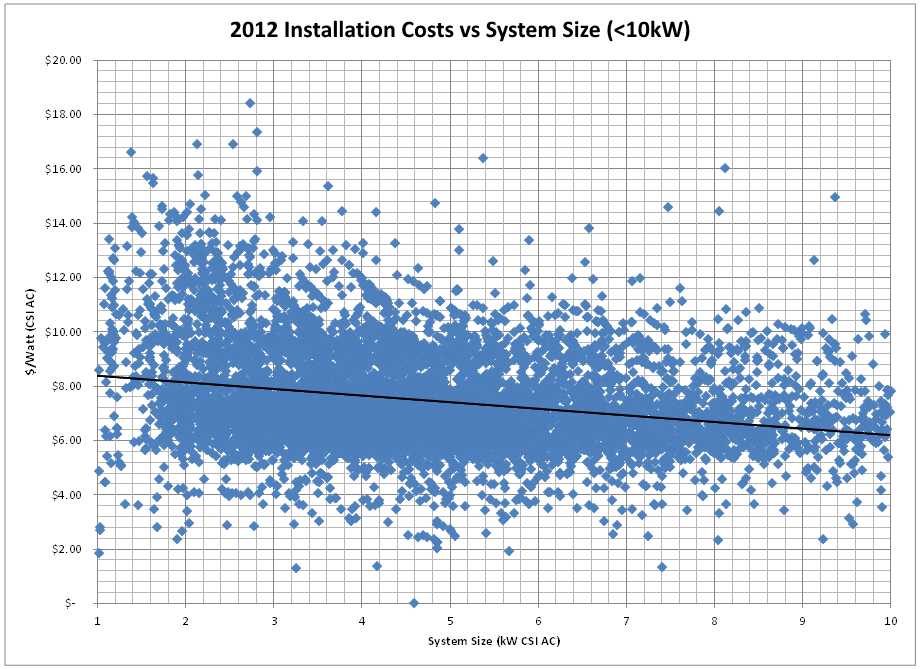 Our trend is still downward as system size gets larger, but the slope is not nearly as steep as it was in our corresponding graph last year. Costs start at $8.59/Watt for the smallest systems and decline to an average of $6.41/Watt for systems just under 10kW. That’s a rate of decline of $0.24/Watt per kilowatt of system size increase, in constrast to a rate of decline of $0.34 last year. Certainly as component costs decrease, their related economies of scale would likely flatten out and that is what this data appears to be showing.
Finally, then, let’s turn to the “big” systems - those between 10kW and 1MW - how did our system costs do in that group?
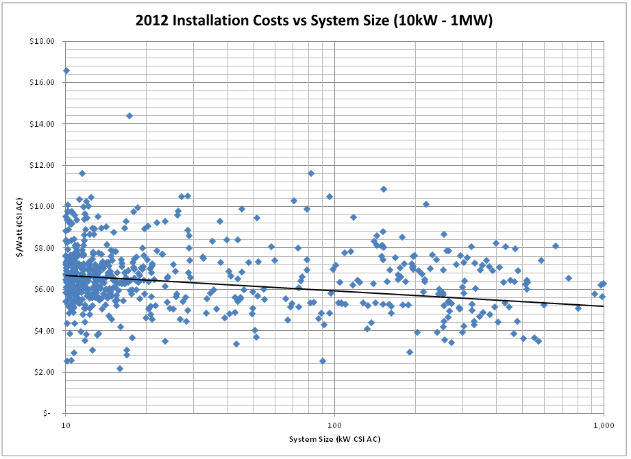
Again, another outlier as our highest system cost here is higher than it was a year ago - $16.50 vs $15.50/Watt. Overall, we continue to see the downward trend as system size increases, but again, not as pronounced as it was a year ago. This year, we see the average cost of a 100 kW system coming in just below $6/Watt whereas a year ago the 100 kW benchmark was closer to $6.80/Watt. So our trend line is lower, but flatter than a year ago.
Moreover, we see far few systems in the 500kW and up category compared to last year. Specifically, this year we have only 24 projects that crossed that threshold (10.98 MW total capacity), compared to 32 last year (21.6 MW). Bottom line - projects have gotten smaller and really large projects have dropped off substantially. Without the pull of those larger systems, it is not surprising that we are not seeing the same downward pressure on costs for larger systems.
Preview of Coming Attractions…
That’s enough to get us started. Yet to come: whose equipment is hot and whose is not? Any significant new kids on the block (be they installers or products)? And who are our outliers this year? (Hint - you’ve already seen some of those names!) So stay tuned as we name names and follow the data wherever it may lead!
And of course, if you have thoughts on cuts of the data that you would like to see, please let us know in the comments.
09/06/11
Categories: Solar Economics, Solar Tax Incentives, SEIA, SCE, Residential Solar, 2011
The State of Solar California - Outliers and Oddities - UPDATED x2!
UPDATE x2 11/8 - Solar City’s Jonathan Bass adds his perspective on our reporting about Solar City - see his response in the comments.
UPDATE 9/30 - We just heard from Jonathan Bass at SolarCity. Details at the end.
(Still no word from Galkos!)
Editor’s Note: We have now done an updated analysis showing the same data from 2012. You can read our 2012 Outliers & Oddities here.
In the first two installments in this series (Part 1 and Part 2) we looked at the most recent data from the California Solar Initiative (CSI) covering the first half of 2011 in SCE’s service area. Using that data we identified trends in cost, equipment and system efficiency. Along the way, we stumbled upon some Outliers and Oddities in the data that left us puzzled and disturbed. In this post we name names, specifically Galkos Construction (aka GCI Energy) and SolarCity.
Before we explain to you why they are featured in this post, we would remind our readers of the Solar Bill of Rights created by the Solar Energy Industry Association (SEIA) in the Fall of 2009. We wrote at some length about the Bill of Rights when it was introduced, but we want to highlight now what then we termed to be, “the most important right of all:”
8. Americans have the right, and should expect, the highest ethical treatment from the solar industry.
Beyond a shadow of a doubt, this is the most important Solar Right of all if we are to build an industry that is respected and trusted by consumers throughout this country. This should almost go without saying - and yet, saying it, and living it, is extremely important.
In our view, if we become aware of situations that don’t live up to that Right, we have an obligation to point them out so that our potential clients can make the most informed decisions possible.
In honor of that principle we present today’s post.
Outliers: Galkos Construction
In looking at the data, from time-to-time a data point would jump right off the screen. For example, examining all of the residential projects in our data - both “completed” and “pending” but excluding “delisted” - we find that the average installation cost in CSI Rating AC Watts is $8.43/Watt (in DC or nameplate Watts that average becomes $6.99). As we noted in Part 1, that number has decreased over time and also decreases as system size increases. Still, given that the residential sector (as designated in the CSI data) only consists of systems between 1 and 10 kW, you wouldn’t really expect significant price variation between installers over a six month period.
But you would be wrong.
Who Charges What?
Here is a chart of the Cost per Watt for the largest installation companies in the SCE service area (you can click on the chart to see it full size):
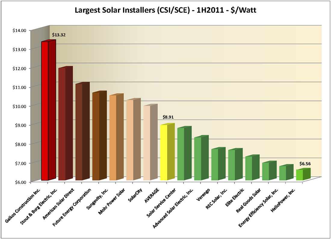
First, let us give credit where it is due. The low end outlier is HelioPower, Inc., at $6.56/Watt, and they did it with an efficiency factor of 87% - second best of anyone on that chart. Nice.
But who is that way off in left field? Coming in at a staggering $13.32/Watt - a full $1.40 higher than their nearest competitor and more than twice what HelioPower is charging - is Galkos Construction, Inc., also known as GCI Energy, out of Huntington Beach. For that money, they must surely be offering only the most efficient and sophisticated technology, right? Not so much. To the contrary, the average installation efficiency for Galkos is only 84.9% - the second worst on the chart and well below the average of 86.11%. In fact, 99% of the time Galkos appears to use Sharp panels - not exactly an exotic solar panel brand - and in particular the Sharp ND-224UC1 panel (66.5%). A quick Google search reveals that the Sharp ND-224UC1 can be purchased, at retail, for $2.65/Watt or less. Given that Galkos handled 400 projects in this data set, it is hard to believe that their price for all of their equipment, particularly the Sharp panels, would not be heavily discounted.
Quality Counts
Quality, of course, is important, and the data does not reveal - though the Internet hints at - the quality of installations from Galkos. Here is how the company describes its own product offerings (from the “Services” page of their website):
Solar by GCI [Galkos Construction, Inc.] Energy
GCI Energy is the largest solar company in Southern California with over 30,000 customers. So you get the most knowledgeable professionals, excellent customer service and a better price.GCI Energy solar offers the highest efficiency solar panels on the market - those manufactured by Sharp. With Sharp Solar Panels, GCI Energy can tailor a solar panel installation to your specific needs and lifestyle, so you get maximum performance without a maximum investment.
(Emphasis added.)
Does Galkos actually have 30,000 solar customers? Certainly not (nobody does). Are they providing “a better price"? It is not clear what their standard of comparison might be - but their price is not better than any of their major competitors in that chart. And of course, the statement does not define what they mean by “the highest efficiency solar panels on the market,” but it seems unlikely that Sharp would make that claim. Here’s one chart that concludes that they couldn’t (note the efficiency of the SunPower and Sanyo panels first, then search for Sharp).
All we can say in response is, caveat emptor.
Oddities - SolarCity
Now we turn to the Oddities section of this post. Unlike the outliers, which were always of interest to us, we were not looking for the oddity we report here - it literally just jumped out at us.
Sold versus Leased
Question: What is the difference in reported cost between systems sold directly to the end customer and those that are leased (i.e., have a third-party owner in CSI parlance)?
The initial difference that we stumbled upon was so startling that we knew we needed to narrow our focus and control for as many variables as possible to isolate that one factor. To achieve that end we restricted the data to those residential systems (i.e., between 1 and 10 kW) that were “pending” in the CSI/SCE data (thus, the newest proposed systems in the data which, based on our Part 1 analysis should mean the lowest cost systems). That way our project sample would be as homogenous as possible, eliminating cost variations based on system size and timing.
Given those restrictions, the top 5 installation companies in which the system is owned by a third party are: Verengo (482 systems), SolarCity (468), American Solar Direct (124), Sungevity (99), and HelioPower (63). Of those five, only two also have direct sales projects pending: Verengo (7) and SolarCity (9). Let’s see how they compare:
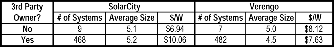
What is going on here? For Verengo, as the number of systems increases - which it does in going from sold systems to leased systems - their cost per Watt decreases - which is what we would expect. But not so for SolarCity - even though they are leasing 50 times as many systems as they are selling, their cost for the leased systems went up - way up - as in up by $3.12/Watt!
(One possible explanation for this discrepancy would be that SolarCity uses much more expensive equipment in their leased systems than they do in the ones that are sold. But they don’t. On their sold systems, SolarCity always selected a Fronius inverter and their panel choices were split among Yingli (56%), Kyocera (33%) and Sharp (11%). On their leased systems, SolarCity selected Fronius inverters 98% of the time and again split their panel choices among Yingli (68%), Kyocera (28%), and BP (3%) with the remaining 1% scattered among Suntech, Sharp and Sanyo. In other words, there is no significant difference in SolarCity’s equipment choices between sold and leased systems.)
Why Does this Matter?
Why does this significant cost differential matter, you might ask? After all, customers aren’t paying that price - they are paying on a lease so the “cost” of the system doesn’t matter to them, all they care about are their lease payments. True enough - unlike the case with our Outlier above, the end customer is not the victim here.
Recall, however, that for systems that are leased, the third-party owner - presumably SolarCity and its investors in this case - receives both the rebates and the tax benefits associated with the installation. While the rebates are independent of the system cost (they are paid based on CSI Watts), not so for the tax benefits. Commercial operators (even though these are residential installations they are treated as commercial projects for tax purposes) are entitled to both a 30% tax credit as well as accelerated depreciation based on the cost of the system.
For the 468 systems that SolarCity is leasing, their total cost is $24,261,735 to install 2,412 kW. If those installations were billed out at the $6.94/Watt they are charging for their sold systems, the installed cost would be $16,739,280 - a difference of $7,524,037. At 30% for the federal tax credit, taxpayers are giving SolarCity an extra $2,257,211 - just from six months worth of installs in only the SCE service area.
Wow!
In the words of the 70’s pop song, How long has this been going on?
How Long Indeed
We decided to find out.
Although all of our analyses up until now in this series have been restricted to the first half of 2011, the actual data set contains entries from the inception of the CSI program. Thus we can look at all of SolarCity’s installs going back to 2007 and compare them as we did for the 1H2011 pending installs above. We will use the First Completed date to group these by year and analyze only “installed” - and not “pending” applications. Here’s the data:
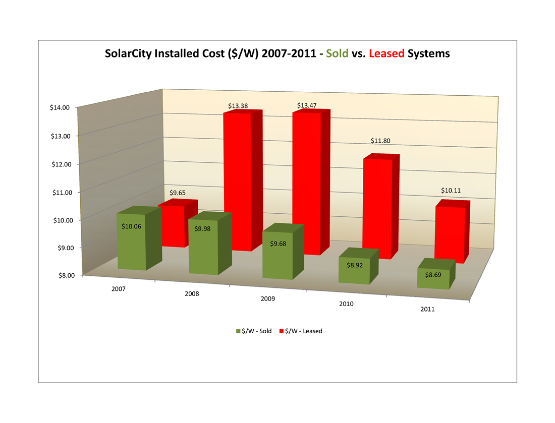
The answer would appear to be, almost from the beginning! Back in 2007, Solar city sold ten times as many systems as it leased. By 2008 the ratio was down to 4-1 and ever since then leasing has been SolarCity’s predominant business strategy with the ratio of leased to sold now standing at nearly 16-1 in 2011.
Bottom Line
What, then, is the cumulative impact to SolarCity’s bottom line from this trend throughout California? We aren’t in a position to calculate the depreciation benefits (since that is a function of the system owner’s tax bracket) but we can readily calculate the added value derived from the 30% federal tax credit due to this increased cost per Watt.
Here is our plot of the cumulative effect of those year-by-year increases:
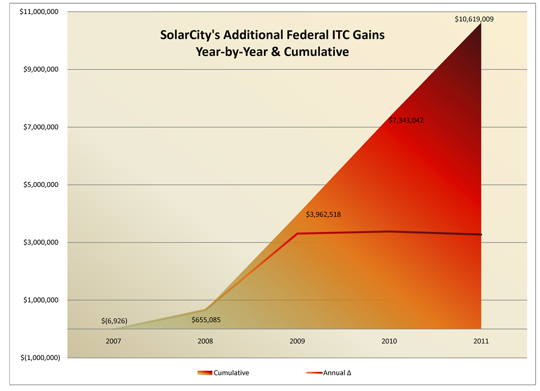
After a slow start in 2007-08, SolarCity’s “model” really took off and has garnered the company an extra $3,000,000+ each year since 2009 (and, of course, 2011 is not yet over) for a total excess accumulation of $10,619,000. Depending on the investors’ tax bracket, the depreciation could be worth nearly as much as the tax credit.
Double Wow!
UPDATE 9/30 - We have now heard from SolarCity
We just heard from Jonathan Bass, Director of Communications at SolarCity who took exception with our report, although he did concede that he could see how we could have reached the conclusions we published in light of the CSI data. We encouraged him to please send us a written response in as much detail as he chose and we would publish it in its entirety. While he agreed that SolarCity would be publishing its response, he did not commit to publishing the information here.
In any event, when we hear more we will update this post again.
What’s Next?
No doubt there is more that we could do with these revelations - but wouldn’t it be better for those with actual oversight obligations to examine this data as closely as we have and to take appropriate action?
As always, we welcome your comments - and if we hear from any of the folks named in this series we will be sure to update the appropriate post.
08/30/11
Categories: All About Solar Power, Solar Economics, SCE, Commercial Solar, Residential Solar, 2011
The State of Solar California - Part 2: Who's Hot and Who's Not?
Yesterday we wrote about our most recent foray into the California Solar Initiative (CSI) data and how that data revealed trends regarding the costs of solar in SCE’s service area during the first half of 2011. We continue today with a look into the equipment that was specified for these projects and explore who’s hot and who’s not.
CSI Data Generally and Equipment Specifically
As a reminder, our data set for this analysis consists of an extract from the CSI Working Data from 8-24-2011 that includes data for SCE installs where major status activity took place during the first half of 2011. That data set consists of a total of 6,306 projects of which 698 are “delisted” (meaning the project’s rebate reservation has been cancelled for some reason), 3,131 are “installed” (completed or in some stage of rebate payment) and 2,477 are “pending” (in some stage of the process from initial rebate application filed but no rebate claim yet filed). For today’s analysis, we will exclude the “delisted” projects from our data, leaving a total of 5,608 projects to analyze.
CSI tracks data about equipment used on projects in great detail. In particular, for every project, CSI allows for up to seven different panel manufacturers and ten different inverter manufacturers! So how many of our projects use multiple panels or inverters by different manufacturers? We would expect not many, and the data supports that surmise. Only 11 projects reflect two different solar panel manufacturers on the same project and in most of those cases the installer has substituted one solar panel for the one originally designated. (Indeed, one project reflects four different panels being identified to CSI for the same project, finally settling on what appears to be two 180 Watt panels plus six 175 Watt panels feeding a single string inverter - curious design, that!) Similarly for inverters, only 24 projects have two different inverter manufacturers specified and no project reflects more than two. Given that, our analysis will only look at the first specified panel and inverter manufacturer.
Solar Panel Trends
So what is happening with solar panels?
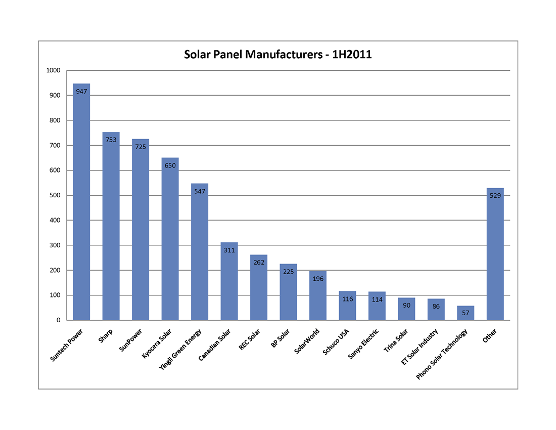 Overall, there are 85 different panel manufacturers included in the data; however, most of them account for very few projects. If we apply a reasonable filter to this data and only look at solar panels that appear in 50 or more projects, the number of represented manufacturers drops from 85 to 14, and the total number of represented projects falls from 5,608 to 5,079. In other words, those fourteen manufacturers account for 90.6% of all of our projects, as demonstrated in this first graph. In fact, the distribution is even tighter with only five manufacturers exceeding 10% of the total: Suntech Power (18.7%), Sharp (14.8%), SunPower (14.3%), Kyocera (12.8%) and Yingli Green Energy (10.8%).
Solar Inverter Trends
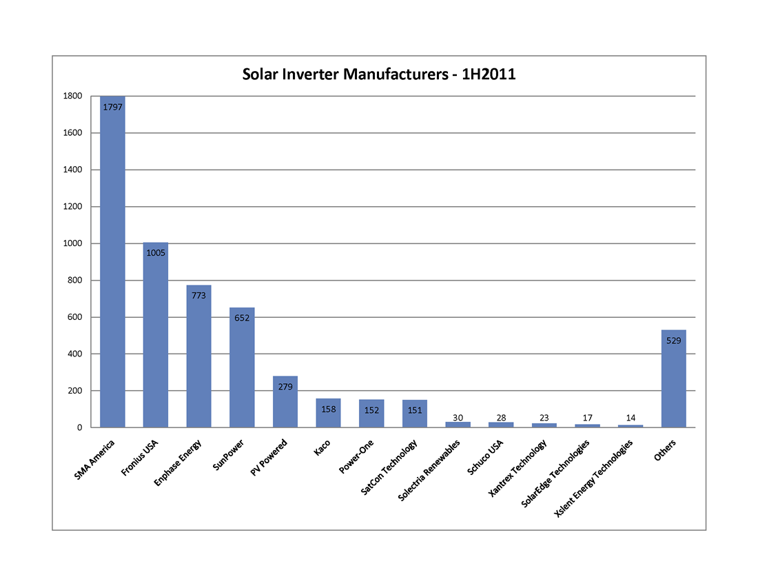
There are twenty-three different inverter manufacturers represented in the CSI data, reflecting the greater complexity of inverters and the more rigorous path required to bring an inverter to market in the U.S. Filtering for manufacturers represented by ten or more systems cuts the list from 23 down to just 13.
SMA America is the runaway winner in this competition. Under their own label, they account for 35.4% of all of these projects. Moreover, the majority, if not all, of the “SunPower” inverters are actually re-branded SMA inverters. When the SunPower inverters are added in, SMA accounts for a whopping 48.2%. That leaves only six other manufacturers to exceed even 1% of the total: Fronius USA (19.8%), Enphase Energy (15.2%), PV Powered (5.5%), Kaco New Energy (3.1%), Power-One (3%) and SatCon Technology (3%).
Two things of interest in those last numbers - the inroads of relative newcomer Enphase Energy (which was only founded in 2006), and the inclusion of SatCon, since alone among that list, it only sells central inverters for the commercial market (where it is dominant).
Popular Pairings
That is how the different manufacturers stack up head-to-head, but what about combinations? Are there pairings of panels and inverters that are most commonly preferred? The data reveals five combinations that account for more than 5% of the total: Suntech panels with SMA inverters (13.5%); SunPower panels with “SunPower” (i.e., SMA) inverters (12.4%); Sharp panels with Enphase micro-inverters (10.3%); Yingli panels with Fronius inverters (8.2%); and Kyocera panels with Fronius inverters (8.2%).
Winners and Losers
While certain pairings are popular - are they cost-effective and how well do they perform together? We decided to look at system combinations from an average $/Watt perspective and from an average CEC efficiency perspective to see what jumps out of the data.
Here’s the first thing that struck us - picking a system with lower-tier panels does not guarantee a lower installation cost. In fact, many of the bottom-tier panels (none of which made the cut in our discussion of panel manufacturers above) had install costs well above our overall average for the data set ($6.37/Watt). For example, we found a handful of systems using solar panels from such luminaries as Apollo Solar Energy, SET-Solar, and REC ScanModule where the average installation cost was more than $10/Watt!
Who was on the very low end of the install cost curve? Gloria Solar, Suniva, Kaneka, Silray and Solaria each had a handful of installations that were below $4.50/Watt.
More significantly, how did our most popular pairings perform? Here’s the data:
| Combination | Average Cost $/W |
| Suntech & SMA | $5.01 |
| SunPower & SunPower | $8.49 |
| Sharp & Enphase | $11.62 |
| Yingli & Fronius | $9.58 |
| Kyocera & Fronius | $9.79 |
What is up with the Sharp & Enphase combination? While Enphase installations are known to cost a bit more than a comparable string inverter installation (confirmed by our own experience), they certainly don’t cost $5/Watt more! Rather, it turns out that the overall average for all Sharp-based systems is $8.53/Watt (nearly $2.00/Watt above the average) with prices ranging from a low of $6.17/Watt (when paired with a Solectria inverter) to a breath-taking high of - are you sitting down? - $19.30/Watt when paired with a Sharp inverter. So who installed that system, you ask? You’ll learn all about it (or at least all that we can tease out of the data) later in this series.
Shifting our attention to efficiency, thin-film module maker First Solar gets the highest overall ranking, 91.7%, thanks to its extremely high STC to PTC ratio. On the more embarrassing end of the scale, Sunlan solar brings up the rear, averaging only 80.7%. From our list of the most popular solar panels, Sanyo (long a Run on Sun favorite) does the best, averaging 89.3% across a variety of inverter combinations. The rest of the top five are: Canadian Solar (87.6%), SunPower (87.5%), Suntech (87.2%), and Schuco (87.0%). The bottom-five of our best selling panels? That dubious honor belongs to: Sharp (86.0%), BP Solar (85.8%), ET Solar Industry (85.6%), Trina Solar (85.5%), and REC Solar (85.1%).
As for our five most popular pairings, here is the data:
| Combination | Average System Efficiency |
| Suntech & SMA | 87.2% |
| SunPower & SunPower | 87.1% |
| Sharp & Enphase | 85.2% |
| Yingli & Fronius | 85.6% |
| Kyocera & Fronius | 86.0% |
That is a pretty tight grouping, with a total range of just 2%. To break out of that mold with a conventional panel/inverter pairing, the Sanyo & SMA combination is your best bet, weighing in at 89.5%.
Who Uses What?
Finally, we decided to see what equipment combinations are preferred by the biggest installers in the market. The following table lists the top-five installers and reports the number of projects in the data, their most frequently chosen solar panel (and % of times used) and their most frequently chosen inverter (and % of times used).
| Name | # of Projects | Panel Mfr (%) | Inverter Mfr (%) |
| Solar City | 910 | Yingli (47.8%) | Fronius (95.5%) |
| Verengo | 688 | Suntech (91.7%) | SMA (81.7%) |
| Galkos Construction | 401 | Sharp (98.5%) | Enphase (99.0%) |
| REC Solar | 207 | Kyocera (42.5%) | SMA (75.4%) |
| Real Goods Solar | 165 | Kyocera (54.6%) | SMA (65.5%) |
Collectively, these 5 installation companies accounted for 42.8% of the projects in the CSI data. Certainly companies this large must have some real clout when it comes to negotiating prices, thereby allowing them to pass along those savings to their many customers.
Or do they?
Find out in our next installment!
08/29/11
Categories: All About Solar Power, Solar Economics, SCE/CSI Rebates, PWP, SCE, LADWP, Commercial Solar, Residential Solar, 2011
The State of Solar California - What Does the CSI Data Reveal?
The California Solar Initiative (CSI) is responsible for overseeing solar rebates for California’s three Investor Owned Utilities (IOUs): PG&E, SCE and SDG&E, and in that role the CSI program collects some very interesting data. As we have in the past, we decided to dip into the data from the first half of this year to gain some insights into the State of Solar in California. Over the next several days we will be reporting on what we have learned - and there are some very surprising things in here to be sure!
Overview & Methodology
A word first about how we processed the CSI data. We downloaded the most recent active data set as of this writing (the August 24, 2011 data set to be precise) and parsed it into Excel. Since we were only concerned about systems in our service area, we excerpted out just the data from SCE. To narrow our focus more, we wanted to only look at applications that had significant status during the first half of this year. The CSI data has a host of date fields - we took the latest of the fields ranging from First Reservation Date to First Completed Date as our Status Date and excerpted those that fell between 1/1/2011 and 6/30/2011 - a total of 6,306 data points.
That’s a fair amount of data but it necessarily omits any data at all from the municipal utilities such as Pasadena Water & Power (where we do much of our work) or LADWP. Unfortunately, none of the munis make their program data generally available - which is particularly odd given that the local residents actually own those utilities (and thus, their data) - but that is a topic for another day.
Finally, for the purpose of these posts, all system sizes are reported in CSI Rating AC Watts (to account for differences in equipment choice and system design) as opposed to DC (or nameplate) Watts.
What can we say about those 6,306 projects? Collectively they account for 164.7 MW of new solar power at a total installed cost of just over $1 billion - with incentive amounts totaling $219 million - roughly 21% of the installed cost. Unfortunately, not all of those are built - or even ever will be. Fully 11% (698) of those projects have the status ‘Delisted’ - meaning that they have been cancelled for one reason or another. Those delisted projects account for 37.8 MW of potential solar power that presumably will never see the sun. (Do some installation companies have a significantly higher rate of “delisted” systems? We will answer that question in a subsequent post - stay tuned!)
The remaining 5,608 are split between “Installed” and “Pending” with 55.8% (3,131) installed and 44.2% (2,477) pending. Breaking that down a little more, the installed projects account for 33.8 MW worth $240.1 million with incentive amounts totaling $57.1 million. In contrast, the pending projects account for almost three times as much capacity at 93 MW worth $575.8 million with incentive amounts totaling $120.6 million. (That is, nearly three times the to-be-installed solar cpacity for roughly twice the rebate dollars.) On average, installed projects cost $7.09/Watt whereas pending projects cost $6.19/Watt - a positive trend for consumers since it shows the cost of solar power systems declining over time.
Does Bigger = Lower Cost?
Finally, for today, let’s examine whether the data supports the notion of solar economy of scale - that is, as system size increases does the installed cost/Watt decline? To get a handle on that, we took two different cuts through our data set - “small” installed or pending systems <10 kW, and “large” systems ranging between 10 kW and 1MW.
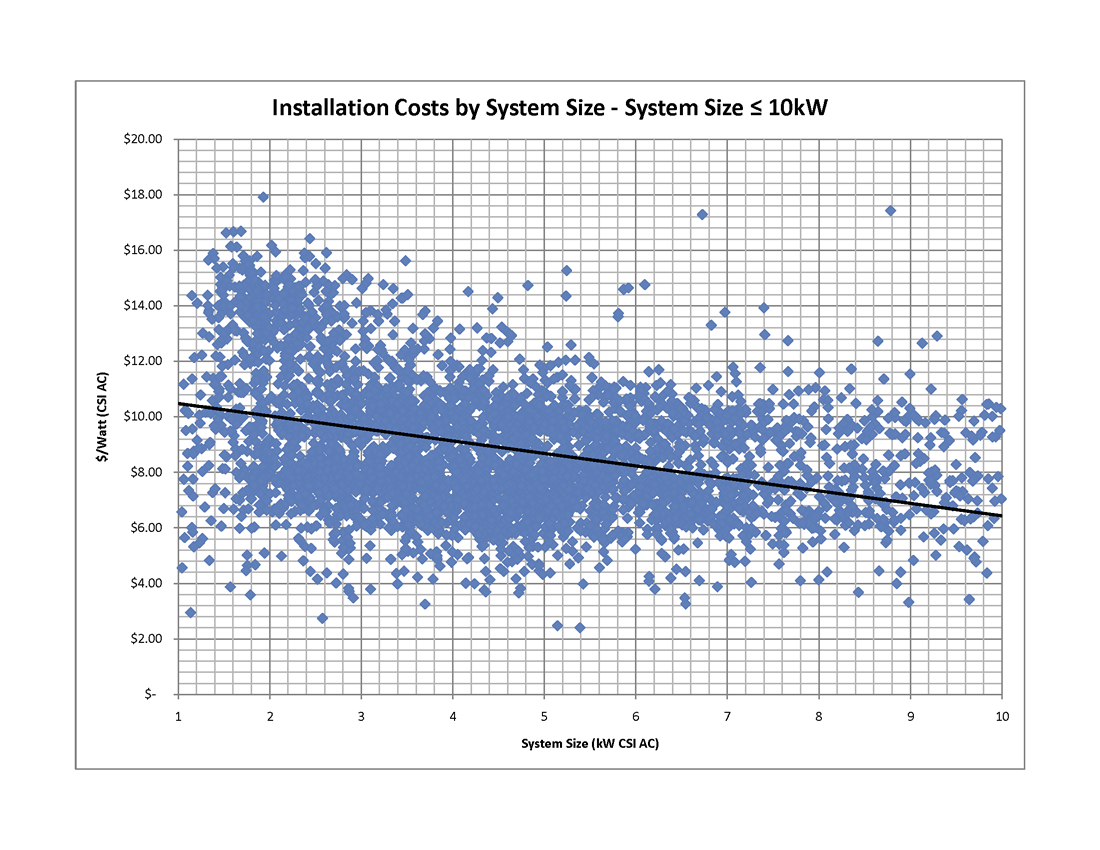 First, here’s the graph for the “small” systems (consisting of 4,992 installed or pending systems - click on the graph to view full size). As the trend line makes clear, larger systems really do drive down costs - decreasing from over $10/Watt at the small end of the range to just above $6/Watt for systems around 10 kW.
Another interesting observation from this graph are the outliers - with some data points below $3.00/Watt (mostly from self-installed system) all the way up to nearly $18/Watt!!! (We will have way more to say about those data points - and who is responsible for them - later in this series.)
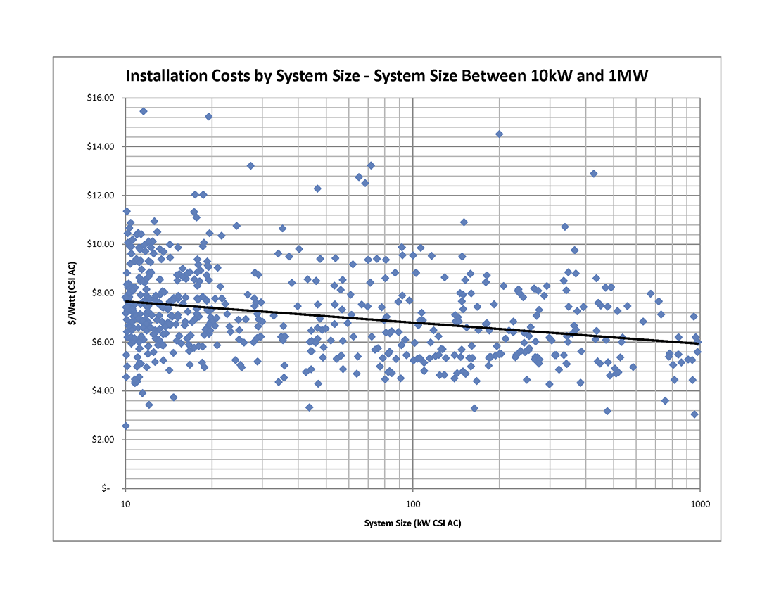
If we now look at larger systems - those between 10 kW and 1MW - our data set has 587 such systems and again, the trend line shows the decline in system costs as system size increases. (Note, because there is such a huge range in system sizes on this graph, we plotted the system size on a log scale.) Some of these outliers are also pretty curious - a 200 kW system coming in at over $14/Watt?
Of course, this data is showing what happens when an individual project gets larger and there the trend is clear. One might well ask, does the same trend apply to larger installation companies? In other words, as a company has more and more installs, does that economy of scale translate into lower costs for the end consumer? That’s a very interesting question and the answer - coming in our next post - just might surprise, or maybe even disturb you.
If there are some other cuts of this data that you would like to see, just let us know in the comments. Trust me, we are just getting started!