Categories: "All About Solar Power"
08/05/13
Who's Hot and Who's Not?
The State of SoCal Solar 2013 - Part 2
In Part 1 of this series we laid out our methodology and identified some trends in the CSI data for the first half of 2013. Here in Part 2 we are going to see who is hot and who’s not as we continue to assess the State of SoCal Solar, 2013.
For this analysis, we left out projects from the MASH program. We also excluded delisted projects but included both pending and completed. That leaves a total of 13,946 projects overall for these analyses.
Top Solar Module Manufacturers
We begin by looking at the leading solar module manufacturers as evidenced in the SoCal market. We break this down by Residential and Commercial market segments and we will also look at sold versus third-party owned systems.
There are two ways to look at who’s on top - by number of projects using a particular manufacturer’s product or by total number of modules being used - we will report both stats. (One caveat - CSI data allows for up to seven different module manufacturers to be associated with any one project. However, for this analysis, we are only looking at the first manufacturer listed. There is not a great loss of visibility from this choice; out of 13,946 total projects, 13,824 - or 99% - only specified one module manufacturer.)
Oh, and of some note, one particularly infamous module manufacturer is nowhere to be seen in the data - Recom - and how fitting is that?
Residential Market
In the Residential market segment, there are 13,619 total projects and 90 different solar module manufacturers represented (compared to 97 last year), accounting for some 337,476 modules being designated (compared to 228,372 last year - an increase of 47.7%). Only 16 manufacturers managed to capture more than 1% of the total modules used (compared to 15 last year) - here they are:
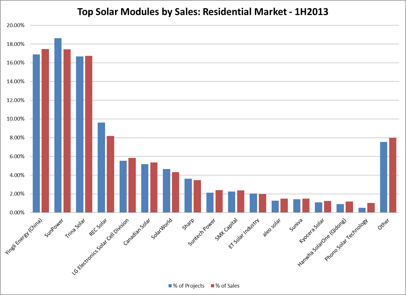
Yingli Energy from China has snatched the top spot from SunPower (last year’s champ) even though SunPower continues to hold the edge in total number of projects using their products. Sadly, Sanyo - now owned by Panasonic - did not even crack this list, reaching just 7/10 of 1% of the total. Oh, how the mighty have fallen.
Those are the results overall but does it matter whether you slice the data by purchased versus leased systems? Indeed it does. For purchased systems, beleaguered German module maker SolarWorld grabs the lead with 13% of all sales (10,411 units) followed by SunPower 12% (9,643 units), Canadian Solar 10% (7,396 units), SMX Capital 10% (7,912 units) and Sharp 5.6% (4,453 units). For leased (i.e., third-party owned) systems the leaders shift again: Yingli Energy recaptures first place with 22% (56,843 units) followed by Trina Solar 20.7% (53,375 units), SunPower 19.1% (49,149 units), REC Solar 9.6% (24,718 units) and LG Electronics 7% (18,066 units).
As for specific models, here are the top ten:
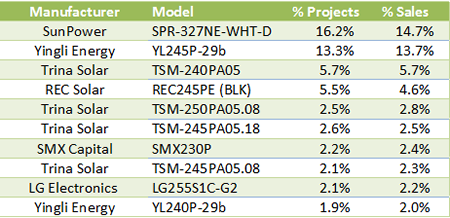
Trina Solar breaks through with four of the top ten models (although two are functionally the same). But this year SunPower has the most specified module model in the Residential market as designated in the CSI data!
Commercial Market
Turning to the Commercial market, 48 different manufacturers are represented in the data (down from 60 a year ago), accounting for the sales of 291,227 modules (down from 350,360 last year - a drop of 17%). Showing greater diversity at the top of the heap than in the Residential market, some 21 different manufacturers made it above the 1% of sales threshold. Here they are:
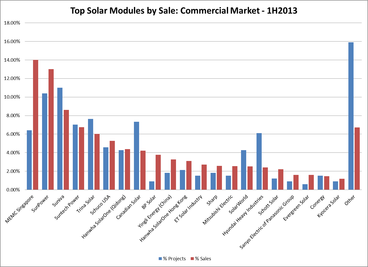 MEMC Singapore takes the lead over SunPower, selling 40,830 units compared to SunPower’s 37,858 - despite SunPower having a clear advantage in the number of projects for which they were selected (10.4% compared to MEMC’s 6.4%).
So who is MEMC Singapore? We had never heard of them before - and they did not crack the 1% mark in last year’s analysis. Turns out MEMC Singapore is a subsidiary of MEMC Electronic Materials, Inc. - which also owns SunEdison. We found this news report from last April indicating that Fox Energy - the PV arm of Foxconn Technology (of iPhone fame) - had entered into an agreement with MEMC Singapore for Fox to manufacture up to 350 MW of solar modules at a facility in Juarez, Mexico - for SunEdison. Indeed, according to the data, SunEdison is the solar company using these modules.
Meanwhile, last year’s leader - Suntech - fell to fourth place this year as it deals with insolvency.
As for the most popular commercial solar module models, here are the top five: SunPower’s SPR-327NE (31,366 units), MEMC Singapore MEMC-M315 (23,554 units), Schuco USA MPE 240 (11,583 units), Suniva OPT315 (11,179 units) and Trina Solar TSM-240 (10,162 units).
Top Inverter Manufacturers
Analyzing inverter sales is a bit different since many projects have multiple inverters and, in the case of systems with microinverters there is one inverter per solar module. So it is not too revealing to report that Enphase sold 17 times as many inverters as its nearest rival, Power-One. Instead, as we did last year, we will look at this by the percentage of projects that designated a particular manufacturer’s product as Inverter #1 in the data.
Residential Market
Twenty-nine manufactures are represented in the data (up from 24 last year), but only 7 exceeded 1% of projects (down from 8 last year). Here they are:
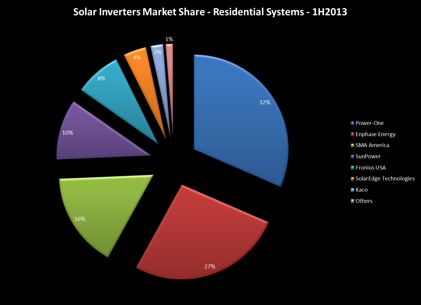 Hottest of the hot is Power-One with 31.5% of all residential projects (up from just 16% last year!), followed by Enphase at 26.5% (up from 21%), SMA at 16.3% (down from 31%), SunPower at 10.4% (down from 16%), and Fronius at 7.9% (down from 10%) rounding out the top five.
In the past SMA has observed, correctly, that you must add-in the market share from SunPower since those are all SMA inverters re-branded for SunPower. True in the past, but somewhat less so today. Looking at the specific inverter models designated under SunPower shows that only 8.3% of SunPower’s 10.4% share is attributable to SMA, with the rest going to inverters made by Fronius and AC modules (which use SolarBridge microinverters).
Once again, does the data change significantly if we compare sold versus leased systems? It does indeed - in the sold category, Enphase dominates with 41.7% compared to SMA at 18.5%, Power-One at 13.3%, SunPower at 8.3% and SolarEdge at 6.1%. For leased systems we get: Power-One at 36.9%, Enphase at 22.1%, SMA at 15.7%, SunPower at 11% and Fronius at 8.6%.
Commercial Market
Turning to the Commercial market, 19 manufacturers are found in the data, with 13 of them holding more than 1% market share. Here they are:
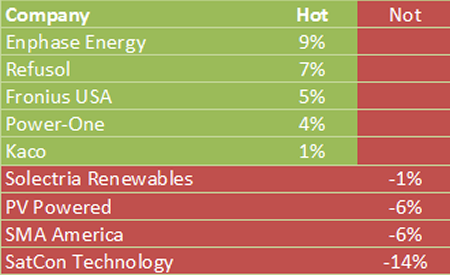
 Wow - now that is a surprise: Enphase has taken over the Number 1 spot! Enphase jumped to 13.2% of commercial projects with Power-One right behind at 12.5%, SatCon (last year’s leader but now in bankruptcy) at 11.6%, SMA at 10.7% and Fronius at 10.1% rounding out the top five.
As SatCon dropped 15%, someone had to pick up the slack and it appears that Enphase got the lion’s share - moving up 9% from last year. Here’s your overall hot/not hot chart:
Popular Pairings
The data would suggest that we could have nearly 3,200 different pairings of module and inverter manufactures, but in reality, the combinations that actually occur are far fewer. Here are the most popular pairings in the data overall:
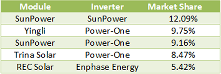
Collectively, these top five pairings account for just under 45% of all projects in the data, and SunPower continues to demonstrate the joy of vertical integration - but its advantage isn’t as strong as it was last year when its pairings accounted for over 19% of all projects. As would be expected by its hot performance overall in the inverter category, Power-One was part of the leading pair for three manufacturers and Enphase cracked the top five with REC Solar.
Who’s Hot and Who’s Not?
Now let’s see what these products are commanding in price. We will look across all projects (excluding delisted and MASH) to see what panels are involved with systems commanding the highest $/W. Here are our results:
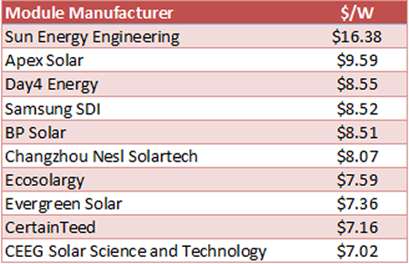 Keep in mind that the overall average cost was just $5.24/W - and yet we have modules being used in project at two to three times as much. Nor are the majority of these what you would call top-tier manufacturers - confirming once again, that spending a lot of money is no guarantee of getting quality in return.
Interestingly, the Sun Energy panels at the top of this list were also at the top of the list last year - only the system cost has actually increased from $16.02 to $16.38/W!
Who Uses What?
Finally, we shift our emphasis from equipment manufacturers to look at who is installing what. Here’s a list of all installation companies with 100 or more projects and the modules and inverters they use the most:
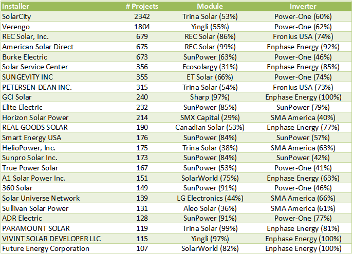 Couple things of note here. First, SolarCity has taken the number 1 spot from Verengo and by a comfortable margin. Second, SMA doesn’t crack this list until the 10th ranked installer. Meanwhile, Power-One has four in the top ten and Enphase has three with Fronius making the top ten twice.
Altogether, overall inverter leader Power-One was the preferred vendor for 7 installers (average loyalty 58%), Enphase was preferred by 8 installers (loyalty 87%), Fronius by 2 (loyalty 74%), SMA by 4 (loyalty 58%) and SunPower by 3 (loyalty 59%).
Collectively, the 24 companies on this chart accounted for 9,805 of the projects in the overall data set - 70.3%. But did that volume lead to better prices for their clients? We will try to answer that question - and possibly raise a few more - in our next post: Outliers & Oddities.
05/31/13
Categories: Solar News, Commercial Solar, Safety, Ranting
Does Quality Sell?
Nothing like a piece in the New York Times questioning the reliability of some solar modules to get tongues wagging and some pointing fingers at “Chinese dumping” while others tell us that solar technology is just not ready for prime time. To us it raises a different question - does quality sell?
The article, titled Solar Industry Anxious Over Defective Panels, points to installations as close as the Inland Empire, having shockingly high failure rates after just two years of being installed. “Coatings that protect the panels disintegrated while other defects caused two fires that took the system offline for two years, costing hundreds of thousands of dollars in lost revenues.” Wow - that is shocking. So who made those defective panels? The reporter doesn’t say.
Nor are any of the problem panels alluded to in this story ever named, citing, in some cases, confidentiality agreements.
Which raises a serious problem with the article: if you cannot identify any of the solar module manufacturers that are having these problems you leave the impression that all solar modules are suspect. (Our analysis on who the guilty party might be is below…)
A quick perusal of the comments to the article reveals the predictable factions: those who echo the Fox News line that solar is a failed technology that only exists because of the Obama Administration’s foolish indulgence in Green Tech; claims that all problems in the solar industry are a result of “Chinese dumping” and the associated China bashing; countered partially by a handful of comments from people who actually know something about the industry.
We find the Chinese bashing particularly problematic - after all, the Chinese are not putting a gun to any project developer’s head and forcing them to use third-tier panels.
Greed is what is causing that.
We have been in business since 2006 and there have always been high quality solar panels available from reputable manufacturers - and they have always cost more than many of the panels offered to us for use in our projects. Scanning the CSI data (see below) reveals that many projects - including many of the largest projects - were built using those “bargain basement” panels. Why? Because it maximized the project developer’s profit.
This is not a new problem, despite it getting a major splash in the “Paper of Record." Indeed, we wrote in the Spring of 2012 about how the decision by project developers to focus on the lowest cost per Watt “will continue to put undue pressure on quality manufacturers around the globe - whether in the US or China. Consumer demand for quality is the ultimate way to improve this situation - and that means educating consumers as to what quality means in this market." A year plus has gone by, but where has that educational effort been? The need is as great - or greater than ever, but sadly, the NY Times piece fails on that score. (If you want to read an earlier, and far more comprehensive article on this subject, check out this piece by the great Felicity Carus: Quality Issues Threaten to Give Solar a Black Eye.)
What’s Up in the Inland Empire?
It’s a Friday morning so we decided to indulge in one of our favorite pastimes and go diving into the CSI data to see if we could identify the guilty party alluded to in the NY Times piece. Here is all they gave us to go on - the project has been in place for roughly four or more years (failed after 2 years, offline for 2 years), located in the “Inland Empire” and its downtime resulted in a loss of “hundreds of thousands of dollars” in revenue. From that we concluded that we needed to look at systems from 2010 or earlier, in the Inland Empire - which we took to mean anywhere in the counties of Riverside or San Bernardino - and of at least 200 kW. Those criteria provide us with 28 potential systems, built with solar panels from just seven manufacturers. Here are our results:
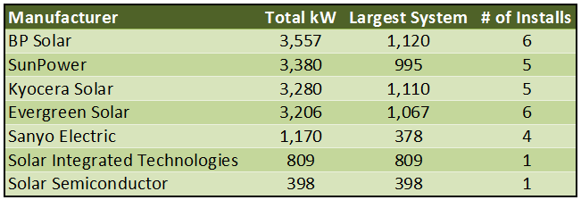
What can we say about these manufacturers? Well, certainly BP Solar, SunPower, Kyocera and Sanyo would all be considered top-tier manufacturers of solar panels - although BP is exiting the solar industry and Sanyo is now owned by Panasonic.
As for the others, Evergreen Solar was a US manufacturer that filed for bankruptcy in August 2011. Solar Integrated Technologies was a subsidiary of Michigan-based Energy Conversion Devices which itself filed for bankruptcy in February 2012. Solar Semiconductor is a vertically integrated systems provider with manufacturing facilities in India.
So who is the guilty party? No way to know for sure, but a little online searching reveals other problems for one of these companies. A September 14, 2012 article on the San Diego Union Tribune website documents problems with “Flawed Solar Panels” that were manufactured by Solar Integrated Technologies. According to the article, the panels manufactured by the company, “had a manufacturing defect that allowed water to seep into crevices of the panels, which in some cases created corrosion and in the worst-case scenario could cause a short that could start rooftop fires” - which sounds a great deal like the problem cited in the New York Times piece.
09/06/12
Categories: All About Solar Power, Residential Solar, Ranting, 2012
Outliers & Oddities - State of SoCal Solar 2012 - Part 3
This is it - time to name names and find out which solar companies are the good, the bad, and - if not ugly, at least Outliers and Oddities!
In Part 1 of this series we laid out our data methodology and showed some of the general trends in the costs of solar power systems in Southern California Edison (SCE) territory for the first half of this year. Part 2 built on that to determine Who was Hot and Who was Not - and of course, being identified as Not Hot is certain to generate a lot more consternation than the other way around!
Now in Part 3 we turn our attention to some curious things that we have found in the data: Outliers who are charging way beyond any reasonable amount compared to their peers, or taking interminably long to complete projects, and Oddities - curious trends that defy easy explanations but raise questions about the State of Solar in Southern California.
Outliers
Last year when we analyzed this data, we discovered that there was one company that really stood out for being a bad actor when it came to over-charging on solar power systems. That company was Galkos Construction, coming in at a staggering $13.32/Watt compared to an average of $8.91/Watt, nearly 50% above the average. (We also noted that HelioPower, Inc. was the lowest in our analysis, coming in at just $6.56/Watt or 27% below the average.) What will we discover in this year’s data?
First a reminder of how this analysis works. Our focus is on systems in the residential market segment since that is the bulk of sales and also where consumers are at greater risk of being pressured into a high-priced sale. (If you are installing a 500kW solar farm and you don’t do your homework, we have somewhat less sympathy for your plight.) Moreover, since the residential segment in the CSI data is limited to systems between 1 and 10kW, there is not as much size difference to skew the pricing data. We excluded systems that were “delisted” so only completed or pending projects are counted. We included, as we did last year, both cash sales and leased systems (although that data has gotten more interesting as we will see later) to capture as many data points as possible. That subset of our data accounts for 8,977 systems with an average system price of $7.23/Watt (CSI Rating).
Finally, since we really only wanted to look at the behavior of the biggest players, we limited our analysis to only those companies with over 500kW of residential projects in the data. As a result, no company had fewer than 80 projects on our list, and the largest had nearly 1,800! These are big players indeed, and they should be able to demand tremendous pricing for their components - but do they pass those savings on to their customers? When we apply this restriction to the data, our sample size is reduced to 6,095 systems (68%) with an average system price of $7.38/Watt - roughly 2% higher than the overall average! Here are our results:
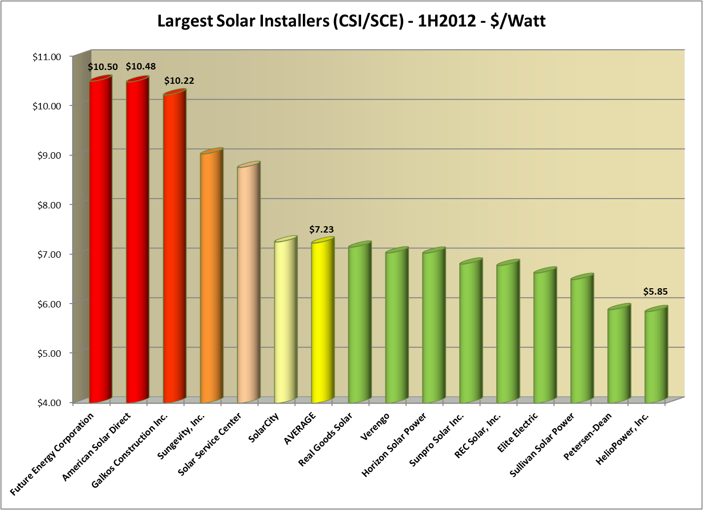 The bulk of our companies here, 9 out of 15, come in below the overall average for this group. And once again, our friends over at HelioPower came in with the lowest system price at just $5.85/Watt. Nicely done, for the second year in a row! (Full disclosure - while none of our projects were in SCE territory during this period, our system price for the first half of 2012 was just $5.33/Watt.)
True Outliers: Future Energy, American Solar Direct and Galkos Construction (Again!)
While down significantly from the stratospheric heights of last year, three companies continue to soar past the $10/Watt threshold: Future Energy Corporation, American Solar Direct, and just like last year, Galkos Construction, Inc. Each of these companies is $3/Watt above the average for the residential market segment. To what can we attribute these crazy prices? Future Energy and Galkos use Enphase micro-inverters (but so do we, and our prices are approximately 1/2 of theirs) and in any event, American Solar Direct uses SMA exclusively, so inverter price is not driving these costs. What about panel choices? No insight there, either: Future Energy uses SunPower, but American Solar Direct uses REC and Galkos uses Sharp (and each uses that brand over 90% of the time). And they each bought a lot of panels: Future Energy bought 3,091, American Solar Direct bought 6,329 and Galkos bought 7,759. Surely that much purchasing power can demand tremendous cost reductions to these companies. Equipment choices are simply not driving these prices.
Cost Caps?
The CSI program has talked about cost caps for a long time, and in the latest published CSI Handbook (from December 2011) we find this provision:
3.4.5 Limitations on Installed Cost
One of the goals of the CSI program is to support a reduction in PV system costs over time as defined by:
Total Project Cost ($)CEC-AC (Watts) = $/Watt
It is the intent of this program to make steps towards this goal. Projects applying and installing PV systems through this program should have their installed cost fall within a reasonable limit. The current average system cost of PV systems ranges from $7.36 to $8.41 per CEC-AC watt, fully installed. To ensure that the integrity of the program is maintained, the Program Administrators may require documentation for why system costs exceed the lower of either of the following:
- $10.26/Watt; and/or
- One standard deviations above the average cost per watt of all projects reaching Pending Payment Status within the last 12 months, whichever is less. (NOTE: As of 8/31/2011, the defined reasonable limit was $10.26 CEC-AC watt, but this value changes as costs decrease. The current limit is available at www.CaliforniaSolarStatistics.ca.gov)
Now this cost calculation is somewhere between the number we are using (which includes the design factor) and the nameplate cost (which is what solar companies typically report because it is the lowest and it also masks differences in equipment value). What would happen if we were to re-jigger our cost values for our three Outliers to present their system costs as defined by the CSI Handbook’s Cost Cap section? Here are the results:
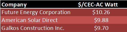
What do you know about that? Future Energy’s average price is exactly at the limit stated in the CSI Handbook to avoid scrutiny by the Program Administrator! What a coincidence! To be sure, all three of these companies exceeded the $10.26 threshold: Future Energy (99 out of 171 times, 58%), American Solar Direct (68 out of 291, 23%), and Galkos (170 out of 482, 35%).
What to make of that? For one thing, it shows that Cost Caps work - despite being dollars above the average cost of their peers, they each managed to at least have their average value remain under the cap. For another, perhaps it would be useful if CSI published those companies that routinely exceed the Cost Cap in a given period? If nothing else, it would help put consumers on notice in ways that they presently are not (unless, of course, they are reading this blog).
We would love to hear from Future Energy, American Solar Direct or Galkos, and we will be happy to print their explanations for these prices unedited, and in full. (Of course, those responses are subject to further analysis.)
Not So Fast
Another type of outlier is the large solar company who signs a contract and then disappears for months on end while the customer waits, and waits, and waits (cue the Casablanca soundtrack). For our same set of big time players, we decided to rank order them by the average time to go from the first filing of a rebate reservation request to the first completion date. While there are lots of reasons for any one project to get delayed, for companies like these that install such a huge percentage of all systems, you would expect to see quick and efficient operations that deliver quality systems in short order. Here is what we found:
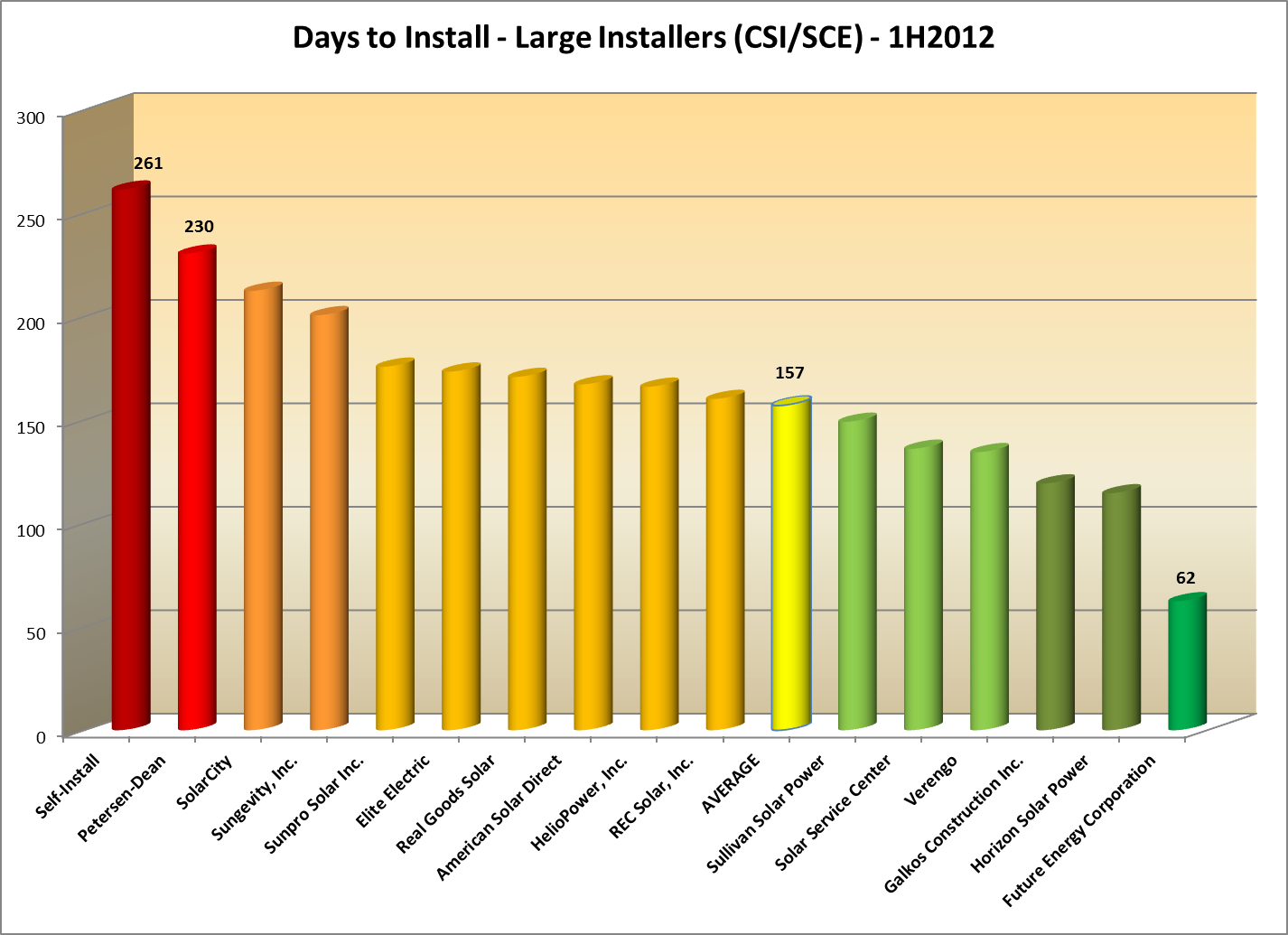
(Wow - Do-it-Yourself’ers take the longest to get their systems built - who would have guessed? Yet another reason why solar is not a DIY project!)
Now isn’t this interesting - Future Energy has the shortest time to install of all of these companies, taking roughly half the time to complete a project as its nearest competitor. Maybe Future Energy customers are getting something for all of that extra money! (Although a little research might reveal some cheaper, faster options…)
The average - which most of these companies cluster closely around - is still in excess of five months, far longer than most solar customers expect to wait. But two companies - Petersen-Dean and SolarCity - have delays in excess of 7 months! Perhaps being a huge company, like SolarCity, makes it harder to be responsive, but what is Petersen-Dean’s excuse? They have 257 systems in this sample (compared to the 1,108 for SolarCity), not that many more than the 171 of our speediest company, Future Energy, and nowhere near the number of systems for Verengo which is actually doing better than the overall average at a delay of 134 days.
This got us to thinking - if we take the average number of days to complete as our benchmark, some companies will be working better and some worse than that average. In other words, some companies are insuring that solar systems are installed faster, whereas others are, sadly, causing systems to be installed slower. What is their cumulative impact?
To measure that, we came up with a new metric which we have dubbed the cumulative System-Years of Delay, or SYD (see Notes at end), which is the product of the total number of systems attributed to a company times the difference between the overall average time to complete and the time for this company, divided by 365. Companies that install faster than average under this metric will have a positive value, slower companies will be negative - thus the goal will be to have the largest value possible. Think of this as whether a company is propelling the overall solar industry forward, or dragging it backward. Here are our results (companies clustered around the average have been deleted for clarity):
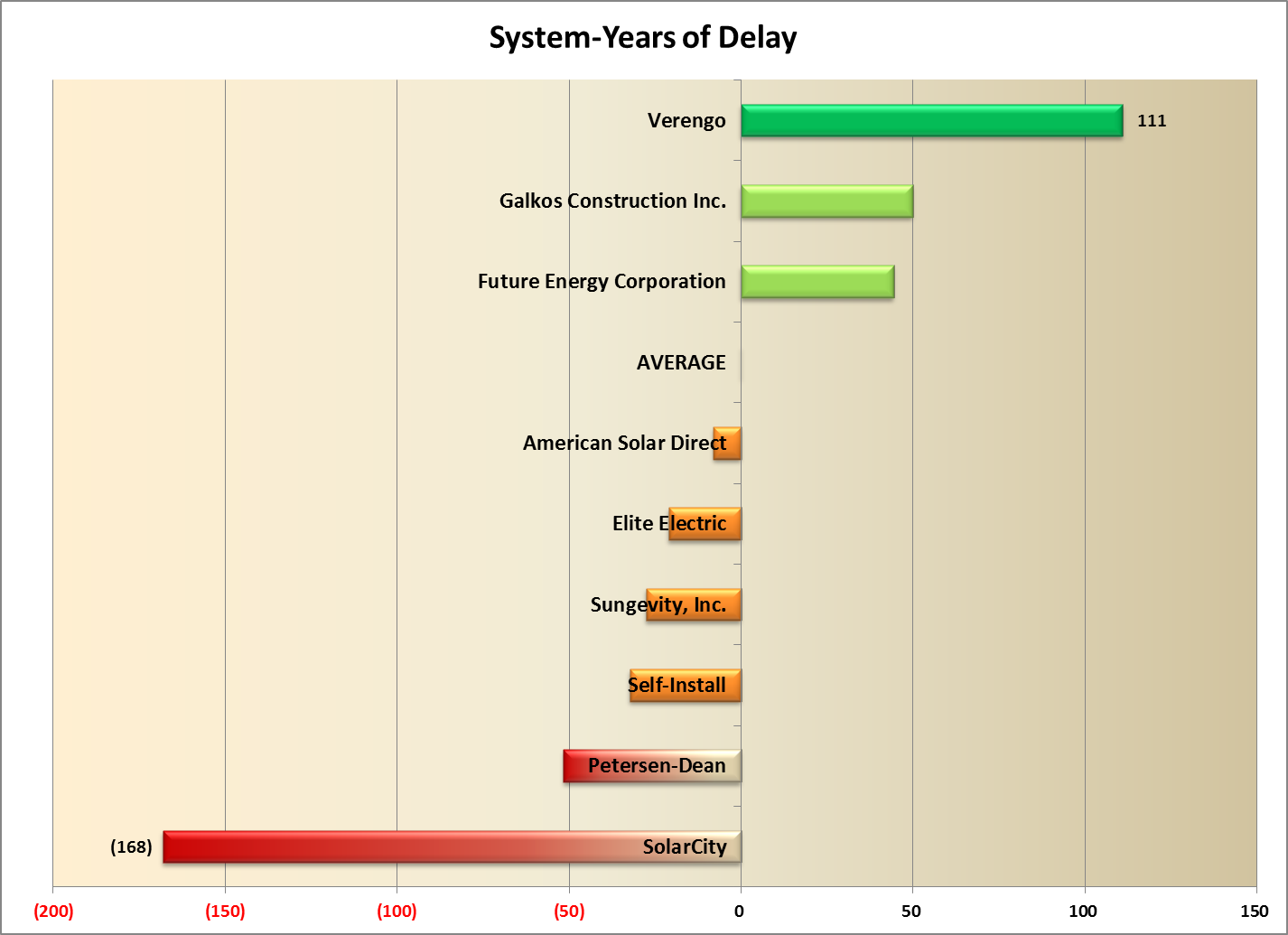 This is a startling result - the two giants of the industry, Verengo and SolarCity, are at opposite ends of this scale! Verengo, which has 1,791 systems in this subset, averaged 134 days to complete a project, 23 days better than the average for our major players. Thus, it is propelling the installation of solar forward since it handles so many systems faster than average. (Future Energy is way faster still, but has a small impact by comparison because it only installs a tiny fraction of the systems Verengo is handling.) To be sure, Verengo’s 134 days is nothing to brag about, but in this crowd of relative slow-pokes, Verengo is clearly leading the way.
So what can we say about SolarCity? Well, first, they are really slow - taking on average nearly two months (55 days) more than the overall average (of five months) to get a system installed. (As with the fastest company comparison, Petersen-Dean takes substantially longer than SolarCity - 73 days worse than average compared to 55 - but they account for far fewer systems - 257 versus 1,108.) But more importantly, SolarCity’s delays become a real setback for the overall industry given the large number of systems for which they are responsible.
Look at it this way: SolarCity, just in this tiny slice of data, representing just a fraction of their overall industry impact, is responsible for the installation of 1,108 systems representing a total capacity of 5.5 MW of residential solar. Assuming an average of 5 solar hours per day, for every day that SolarCity delays installing these systems, 27.5 MWh of energy is not being produced. Factoring in their 55 day delay beyond the average of their peers means that 1.5 GWh of energy was not produced, and instead, 498 additional tons of greenhouse gases were emitted (see Notes at end). SolarCity’s delays are bad for the solar industry, and bad for the environment.
Oddities
Which brings us to the Oddities section of this post. One year ago we stirred a bit of controversy by observing that SolarCity’s system prices for leased systems were far higher than what they reported for cash sales. We thought this was odd because there was no similar discrepancy in the data for the other large player in the leasing space, Verengo. So naturally, we needed to revisit that analysis this year and see if that trend was continuing.
Our analysis last year tried to focus on the most recent projects in the data, and so restricted the data set to just include “pending” systems, eliminating those that were installed or delisted. Last year, SolarCity charged $10.06/Watt for its 468 leased systems compared to Verengo which only charged $7.63/Watt for its 482 leased systems.
Here’s what this year’s data reveals:

First some mundane observations: while Verengo has increased its number of pending systems from a year ago by roughly 45% (consistent with the overall growth in this data set from a year ago), SolarCity actually declined by roughly 24% and Verengo now has nearly twice the share of this segment as does SolarCity.
But of course the shocking data point is SolarCity’s cost per Watt - all the way down to $6.61, and now tied (exactly) with Verengo! This is a remarkable development given that the overall downward trend in prices over the past year was far, far more modest than the precipitous drop reported by SolarCity.
We decided to investigate this a bit further. In particular, if the decline in SolarCity’s pricing was simply that they were better able than most to take advantage of lower equipment prices, we would expect to see a gradual decrease over time from last year’s high to this year’s low. To test that hypothesis, we went back to the overall data set and expanded our analysis to look at all California data (i.e., including PG&E and SDG&E data in our analysis). In addition, because we needed to go back to 2011 data, we included completed projects (i.e., “installed” in the data) as well as pending projects. We then aggregated them by month and calculated the month-by-month average system cost from January 2011 to June of 2012. Here’s what the data disclosed:
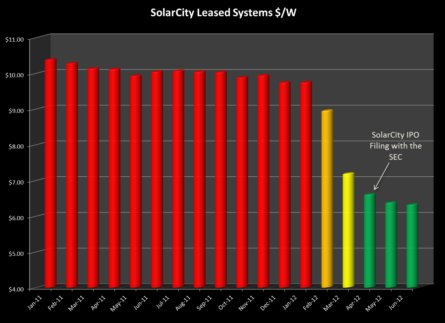 For thirteen months, from January 2011 through January 2012, SolarCity’s system costs were remarkably stable - at or near $10/Watt. But then something amazing happened and in the space of three short months, SolarCity slashed its prices from $9.74/Watt in January to just $6.60/Watt in April - a drop of more than a dollar a Watt per month! Now our buying power is nothing compared to that of SolarCity, but we certainly didn’t see price declines anything like that!
And then we remembered something else that happened back in late Winter and early Spring (although the memory is a little fuzzy given that we haven’t heard anything more about it since). From Bloomberg.com (April 9, 2012):
Elon Musk, who leads Tesla Motors Inc. (TSLA), said an initial public offering of SolarCity Corp. may occur this year after a review of accounting, with an IPO of Space Exploration Technologies Corp. probable in 2013.
Plans to sell shares in SolarCity, which leases rooftop solar-power systems, won’t advance until “additional clarity on the accounting” for those leases is provided by auditors and the U.S. Securities and Exchange Commission, Musk said in an April 5 interview. Bloomberg reported Feb. 1 that the San Mateo, California-based company was seeking an IPO as early as last month, citing three people with knowledge of the matter.
“There is this question of how do you account for something when it’s a lease,” Musk said. “Not all of them are structured in the same way. We want to just double-check with our auditors and the SEC before we file to make sure the accounting is correct.”
Rumor has it that the SolarCity IPO may have stalled over concerns by the SEC regarding those very accounting practices. If the need to “clarify” its accounting - specifically the manner in which it calculates the fair market value of its leased systems - is what is driving down this pricing it begs the question: Will SolarCity voluntarily revisit the accounting for all of its previously leased systems and refund the excess federal tax credits and depreciation that it has received based on what its present conduct seems to concede was an overstated valuation? Time will tell.
System-Years Delay
The SYD formula in full looks like this:
![]()
Where CountX is the number of systems installed by Company X, AvgInstallDays is the overall average for this group of companies (157 days) and InstallDaysX represents the average number of days to complete an installation for Company X.
SolarCity’s Excess GHG Emissions
Excess greenhouse gas emissions attributable to SolarCity’s delay was calculated as follows: We used the EPA’s eGrid Calculator to estimate the GHG emissions from SCE’s energy production. That figure comes to 659.6 lbs/MWh. We calculated in the article that SolarCity’s delay accounted for 1.5GWh (1.512 GWh to be precise, or 1,512 MWh) of energy not produced by those solar systems during the delay period. That works out to 997,315 lbs of GHG or 498 tons.
08/24/12
Categories: All About Solar Power, Solar Economics, SCE/CSI Rebates, SCE, 2012
State of SoCal Solar 2012 - Part 1: Overview
UPDATE - Read Part 2 of our series here: Who’s Hot and Who’s Not?
One year ago we wrote a three-part series analyzing six months worth of CSI data that turned out to be our most read blog posts ever. So back by popular demand, here is our analysis of the first half of 2012 CSI data in the SCE service area.
Methodology
First a brief review of our methodology. We started by downloading the Working CSI data set dated August 22, 2012. (Here’s a link to the CSI Working Data download page, and here’s a link to the data set (8MB zip file) that we used for our analysis.) As we did a year ago, we limited our analysis to just the data from the SCE service area. To limit our time period to the first half of 2012 (equivalent of what we did last year), we took the latest of a series of milestone dates in the CSI data (from First Reservation Date to First Completed Date) and used that as our Status Date and limited that date to values from 1/1/2012 to 6/30/2012. Collectively, that accounted for 9,669 projects, an increase of 53% over the same period last year!
So that we can compare apples to apples, our analysis uses CSI AC Watts as the measure of system size (except where noted) instead of the more commonly reported DC or Nameplate Watts. Why did we do that? Well, not all 5kW Nameplate Watts systems are the same. Some systems use less efficient inverters whereas others have panels that have very poor temperature performance (as indicated by their PTC rating), and some sites are poorly oriented or have substantial shading. CSI AC Watts values take all of those factors into consideration - thereby giving a truer measure of the system’s actual performance.
Overview
Apart from the dramatic jump in the number of projects over the same period last year, how does the overall data for the first half of 2012 compare to that data from last year? Here’s what we found:
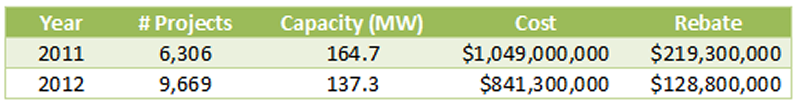
Even though the number of projects increased dramatically from the same time period last year, the potential installed capacity of the projects declined significantly. This may well reflect the expiration of the federal 1603 Treasury Grant program as it became harder to finance new commercial projects after the first of the year. Here’s how the averages changed from 2011 to 2012:
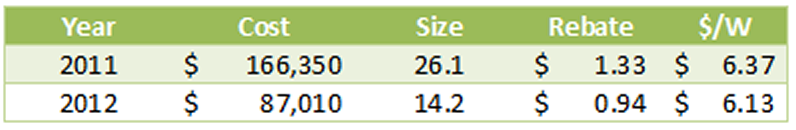
The average system size in the 2012 data dropped 46% from the same period in 2011. Likewise, rebate expenditures per Watt fell from $1.33 to $0.94, or 29%. At the same time, the system cost per Watt also declined, but far less dramatically, from $6.37 to $6.13/Watt. We will have more to say about system costs later.
Altogether, the data reflects a total of 519 different solar contractors, of which 213 (41%) were responsible for only one project.
Delisted by Design?
One intriguing item we noted last year was the significant number of projects - a full 11% - that were categorized as “delisted” meaning that they had been cancelled for one reason or another. How did that number fare in our new data? It dropped significantly down to just 4.2% of all projects, 6.3% of the potential installed capacity.
Of course, projects can be cancelled for a host of reasons. Nevertheless, we decided to see if there were any companies that jumped out as having an unusually high rate of delisted projects. We listed all of the companies that had any projects flagged as delisted (a total of 113 different companies) and compared that to their total number of projects. We extracted those companies that had ten or more delisted projects and rank ordered them by the percentage of all projects that were delisted.
Here’s what we found:
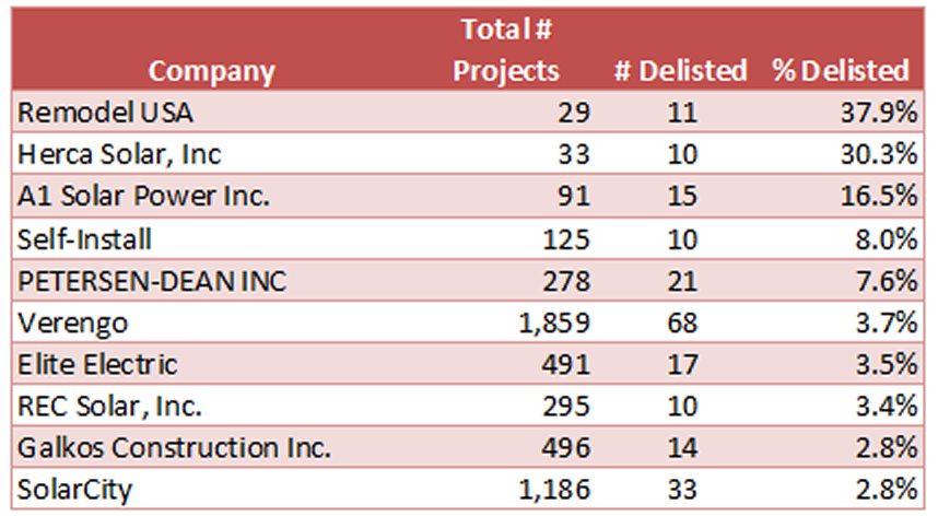
Holy smokes, what is going on here? Either Remodel USA, Herca Solar and A1 Solar Power are really unlucky, or something about how they create projects would seem to be problematic. We will have more to say on this point in a subsequent post in this series.
Oh and a note to Do-It-Yourself’ers - you have a one in twelve chance of not completing your solar project. Maybe solar really is something better left to the pros!
Is Bigger Still Better? (Or at least Cheaper?)
We closed Part 1 last year by looking at how the size of a system drives down the cost, and we wondered if the same would hold true this year? To find out, we excluded delisted projects from our data and divided the remaining projects based on system size with one category being systems below 10kW and the other being between 10kW and 1MW. (Strangely, we had to exclude some real outliers from our “small” system category - can you believe it, we found systems priced at over $30/Watt? Again, much more to say about that in a subsequent post.)
Here’s our results for the small system category:
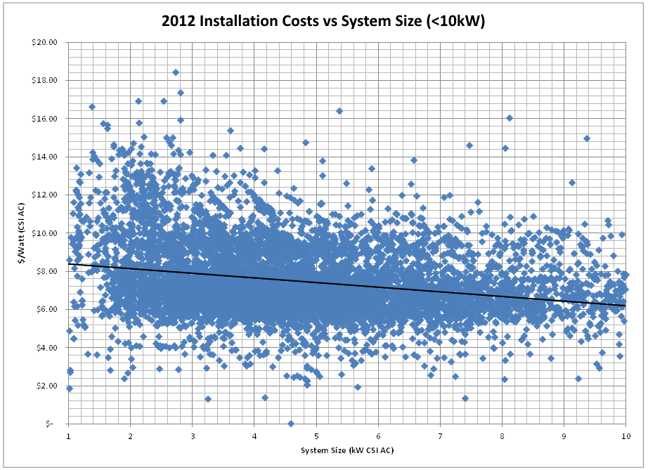 Our trend is still downward as system size gets larger, but the slope is not nearly as steep as it was in our corresponding graph last year. Costs start at $8.59/Watt for the smallest systems and decline to an average of $6.41/Watt for systems just under 10kW. That’s a rate of decline of $0.24/Watt per kilowatt of system size increase, in constrast to a rate of decline of $0.34 last year. Certainly as component costs decrease, their related economies of scale would likely flatten out and that is what this data appears to be showing.
Finally, then, let’s turn to the “big” systems - those between 10kW and 1MW - how did our system costs do in that group?
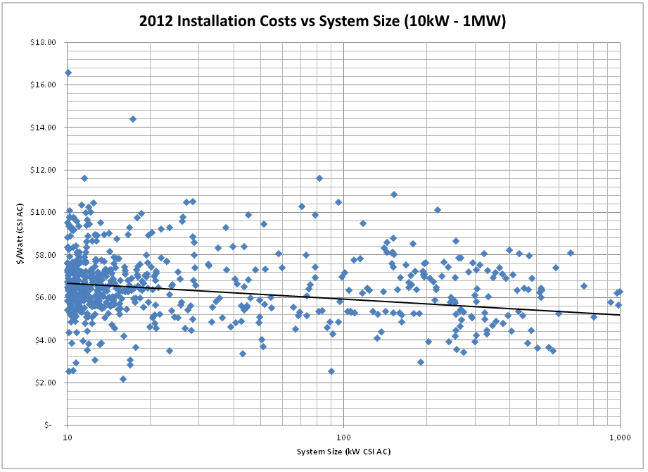
Again, another outlier as our highest system cost here is higher than it was a year ago - $16.50 vs $15.50/Watt. Overall, we continue to see the downward trend as system size increases, but again, not as pronounced as it was a year ago. This year, we see the average cost of a 100 kW system coming in just below $6/Watt whereas a year ago the 100 kW benchmark was closer to $6.80/Watt. So our trend line is lower, but flatter than a year ago.
Moreover, we see far few systems in the 500kW and up category compared to last year. Specifically, this year we have only 24 projects that crossed that threshold (10.98 MW total capacity), compared to 32 last year (21.6 MW). Bottom line - projects have gotten smaller and really large projects have dropped off substantially. Without the pull of those larger systems, it is not surprising that we are not seeing the same downward pressure on costs for larger systems.
Preview of Coming Attractions…
That’s enough to get us started. Yet to come: whose equipment is hot and whose is not? Any significant new kids on the block (be they installers or products)? And who are our outliers this year? (Hint - you’ve already seen some of those names!) So stay tuned as we name names and follow the data wherever it may lead!
And of course, if you have thoughts on cuts of the data that you would like to see, please let us know in the comments.
05/25/12
Categories: All About Solar Power, Westridge PAC Project
Solar Eclipse - A Data Geek's View
On Sunday, May 20, 2012, an annular eclipse was visible in large parts of the United States, including here in Pasadena. To the data geeks here at Run on Sun, that gave us a view to the eclipse that was just a bit different - a Data Geek’s view, if you will.
One of the great things about having a solar power system that is monitored - particularly with a system like Enlighten from Enphase - is that it automatically captures a great deal of data and sometimes that data can be used to look at some surprising things - like a solar eclipse! So this will be a brief tutorial on how to take a raw data set and turn that into a graphical representation of the solar eclipse. (We used Excel 2010 for our analysis, but any tool that allows for the creation of pivot tables should allow you to do the same thing.)
Hypothesis
We started out with a simple hypothesis - since the annular eclipse covered as much as 80% of the sun’s surface (as seen from SoCal), we would anticipate that there would be a significant impact on the output of a solar power system during the eclipse. If we looked at the data from the days prior to the eclipse (excluding any days that were dominated by cloud cover during the relevant time when the eclipse occurred) we should see a noticeable decline in system output relative to the other days. If we graphed those days on the same graph, the eclipse should be an obvious outlier.
But to test our hypothesis, we would need to gather some data!
Data, data, data…
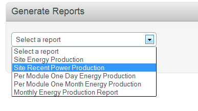 The Enphase Enlighten website allows a system owner to access a variety of reports about how the system has been performing. One of those reports is titled “Site Recent Power Production” and it provides a comma separated values (csv) file that contains the site’s power output over five minute intervals for the preceding seven days.
Excel will open the .csv file and once you have it opened, you can begin the process of massaging the data into the form needed to “see” the eclipse. (If you care to follow along, you can download the dataset that we used by clicking on this link.)
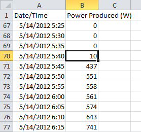
The raw data consists of two columns: a time stamp value and the power produced at that moment in time in Watts. The time stamp combines the full date with the time of day, and as you can see here, the time increases in five minute intervals. Altogether, our week’s worth of data consists of 2,016 data pairs which we will ultimately want to graph.
However, we want to partition the data into seven discrete days (which will then be graphed on top of each other), with hours of the day and five-minute intervals on the X-axis. To achieve that end, we need to add some columns based on the time stamp value. Fortunately, Excel has a number of built-in functions that will let us do exactly what we want to do with a minimum of effort.
By-the-way, it is interesting to note that the system is already generating a significant amount of power by 5:45 in the morning! The system being monitored has 209 solar panels which means that at 5:45 we were receiving, on average, just over 2 Watts per panel.
This ability to produce power at very low levels is another way in which a microinverter system helps to maximize overall system yield.
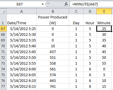
We continue this process by creating columns for the hour and the minute. Fortunately, this is nothing more than using the built-in “hour” and “minute” functions from Excel. By selecting our date/time field with hour and minute, we can establish the remaining data fields that we will need.
However, we now have lots of rows of data to process and making sense of that can be difficult—difficult, that is, unless you use pivot tables.
Pivot Table to the Rescue!
Now we are ready to create our pivot table. For those of you who do not know, pivot tables are a data geek’s best friend, and the means by which massive amounts of data gets distilled into a meaningful table - and ultimately a graph. There are lots of things that you can do with a pivot table but the one we will be using here is very simple.
On the insert tab choose pivot table. For the data source select the power column and the three new columns that we just created. You can embed the table on the current worksheet or in a new one.
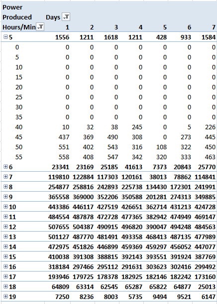
Then do the following:
- Select the “Day” field and drag it to the “Column Labels” box.
- Select the “Hour” field and drag it to the “Row Labels” box.
- Do the same thing with the “Minute” field.
- Now drag the “Power Produced” field to the “Values” box. Note that it gets labeled as “Count of Power Produced (W)” in the box and all of the data values are “1″s. What Excel is doing is counting how many power values there are for each five-minute interval - not what we want.
- To change it, click on the down arrow next to the field and select “Value Field Settings…” Where it says “Summarize value field by” change from Count to Sum and click OK.
- Click on the heading “Column Labels” and type Days.
- Do the same for “Row Labels” and enter Hours/Minutes.
- We don’t need the “Grand Total” so right mouse on that heading and select “PivotTable Options…” Click on the “Totals & Filters” tab and deselect both of the Grand Totals options.
If you’ve followed along correctly, you should have a pivot table that looks like the one on the right.
Click on the drop down filters and deselect the “blank” value for both Days and Hours/Mins. Also, we only want hours where the total power exceeded zero watts, so select Value Filters from the Hours/Minutes drop down. Select Greater Than… and enter 0.
Now we are ready to create our graphs.
A Picture is Still Worth a Thousand Words!
We have distilled our 2,016 rows of raw data into a more manageable form, but it is still hard to “see” our eclipse - time to graph this and let the data speak for itself!
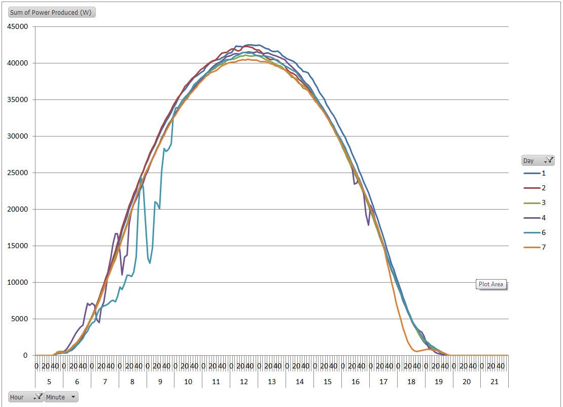
From the PivotTable Tools menu, choose options and then click on PivotChart. Choose a Line chart from the pop-up. Right mouse on the chart and select “Move Chart…” to move it to a new worksheet. This looks pretty good, but Day 5 is very noisy - let’s exclude it. Click on the Day drop down and deselect Day 5. That’s our eclipse graph on the right.
Can you “see” the eclipse now? The chart is still quite busy; let’s exclude some additional days to see if we can make this cleaner.
Return to the Day drop down and exclude every day except days 3 & 7. Now our new graph just tracks two days and we excluded a lot of distractions from what we were seeking.

Here’s our new graph:
The graph clearly illustrates that these two days saw almost identical power production for the vast majority of the day, until late in the afternoon. The timing of that sole difference coincides with our eclipse - can we zoom in for a closer look?
Easily enough we can - all we need to do is limit the time span displayed to the time period associated with the eclipse. The eclipse began around 5:25, reached its maximum roughly an hour later and was over by an hour after that. By selecting the Hour drop down filter we can limit the time period to the four hour window between 5 and 8.
Here is our final “view” of the eclipse:
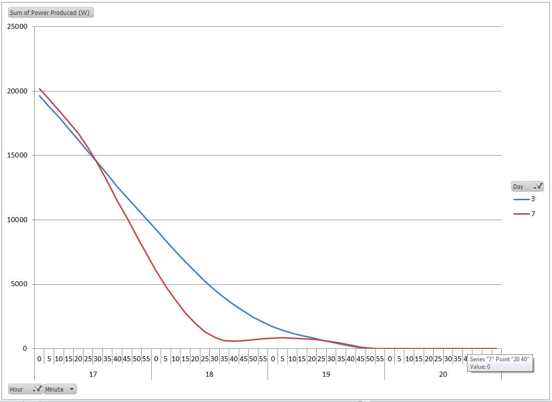
Our final graph clearly depicts the impact of the eclipse on the power output of our solar array.
Monitoring systems are generally considered an important part of commercial solar systems since they help the system owner maximize their investment. However, this is just one example of how a monitoring system can also be used as a tool to observe and quantify other real world phenomenon - making this an important adjunct to a solar power system at a school - like this one at the Westridge School for Girls in Pasadena.