Category: "Ranting"
07/23/14
Categories: All About Solar Power, Utilities, Energy Efficiency, Ranting, Energy Storage
Teaching the Duck to Fly
There is a fair amount of talk lately (in nerd circles) about a graph being circulated by the utilities and the California Independent System Operator ( CALISO, the entity that manages the electric grid in the state). Known as the “Duck graph,” it is being presented as a dire prediction of impending grid instability due to the increasing role of renewable energy sources. But where some see doom and gloom, others see opportunity. Here’s our take. (H/T John Farrell at REWorld.)
Here’s the graph (credit, CALISO):
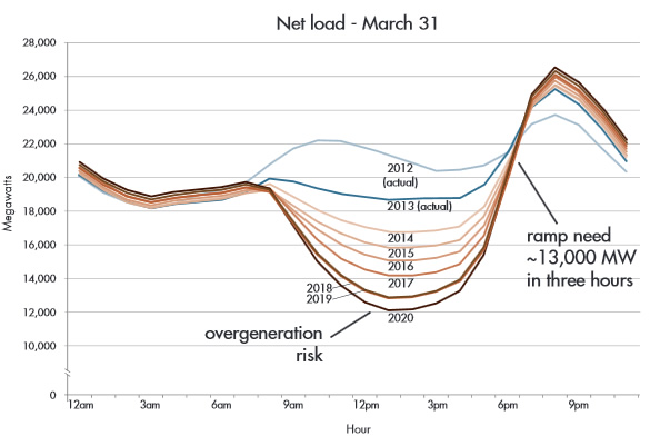
As recently as 2012, this wasn’t a duck at all as net load had two peaks, one in the morning and one late in the evening.
But look at the center of the graph: as more and more renewable sources come online, the demand during the middle of the day falls dramatically, so much so that the utilities are complaining that there will be a risk of “over generation” - producing more energy than is needed and cutting into the baseline production (from power plants like coal and nuclear that need to operate continuously to be efficient.)
Also predicted is a rather steep increase in evening demand between now and 2020.
The net result is a curve shaped much like a duck, apparently a fowl predictor of grid chaos.
Frankly, we look at that graph and see progress and opportunity. Progress in that renewables, which not so long ago were sneered at as being a, “tiny amount of energy that will never amount to anything serious,” are now completely rewriting the load curve in the nation’s most populous state. Talk about coming a long way, baby!
The opportunity, of course, is right there as well. While adding large amounts of smart storage to the grid is an obvious fix for this “problem", as we noted just the other day (see Can Renewables Power the US?), we can handle this evolving energy future in a relatively simple manner—it just requires changing how we approach the problem. Here’s the video:
We can, and will, teach this Duck to fly.
09/17/13
Run on Sun Named One of Top Solar Contractors
Solar Power World, which recently quoted Run on Sun Founder & CEO Jim Jenal at length in a news article, has just announced their annual listing of the Top 250 Solar Contractors in the United States and Run on Sun made the list, coming in at number 234.
From Solar Power World’s editorial announcing the list:
These companies have the vision to succeed in an industry dismissed by so many around the world. These companies — these visionaries — are poised to take full advantage of the near-term solar boom that none other than researcher Shayle Kann has predicted for the U.S. industry.
It is these businesses that have fueled the three-year growth of this industry of 227%. The Solar Power World’s Top 250 employ 73,068 people and installed 3 GW in 2012 alone. They have installed 7.8 GW overall. They represent the best across all three segments — utility, commercial and residential — that make this industry so vibrant. In an industry now valued at $11.5 billion, these are the companies that have built it.
 For a small, regional company like Run on Sun, it is a great honor to be listed among the biggest and best known solar companies in the country. We are proud of our role in building this industry, and proud to be a voice for making the industry live up to its vision. After all, you cannot claim to be part of building a sustainable future if you engage in shoddy business practices or stoop to unsavory marketing tricks.
So congrats to all our colleagues who made the list - here’s to continuing to grow an industry we all love!
08/07/13
Outliers & Oddities - State of SoCal Solar 2013 - Part 3
Ok, listen up - you know who you are, you Outliers and Oddities - but now it is time for everyone else to learn your deep, dark secrets as we name names and tell all - at least all that can be told from the CSI data! Grab your popcorn and let’s dive in, shall we? (If you overlooked Part 1 of this series you might want to check it out to recall our Methodology.)
Outliers
In looking at Outliers we focus on the Residential market since there is greater potential for consumers in that space to be exploited. After all, if you are building a 500 kW commercial project and you don’t do your homework, well, shame on you. But folks in the Residential space are more likely to be exposed to high-pressure sales tactics and other forms of abuse.
Another reason for looking at Residential systems is that the size range is very narrow: from 1 kW to 10 kW. That limits the amount of cost variance you would expect to find (and we found) if you were looking at larger systems. So the data here consists of Residential projects, both purchased and leased, but excluding MASH and delisted projects. This subset of the larger overall data set consists of 454 companies, 13,619 projects with a total capacity of 75.8 MW and an average cost of $5.84/W.
(Full disclosure, projects by Run on Sun came in at $4.78/W - proving that sometimes you can save money when you go with the best! But I digress…)
Companies in this subset varied between having just one project in the data (152 companies appear only once) to SolarCity which has a whopping 2,326 projects.
To make any meaningful comparisons we have limited the companies in this analysis to just the very largest players. Whereas last year we made that cut at 500 kW installed or more, today that filter still includes too many companies to readily compare, so this year we set the bar at an even 1 MW. Even at that threshold, we still have 15 companies on this list. Surely companies that large can afford to pass along their savings to their customers, right?
Here’s what we found:
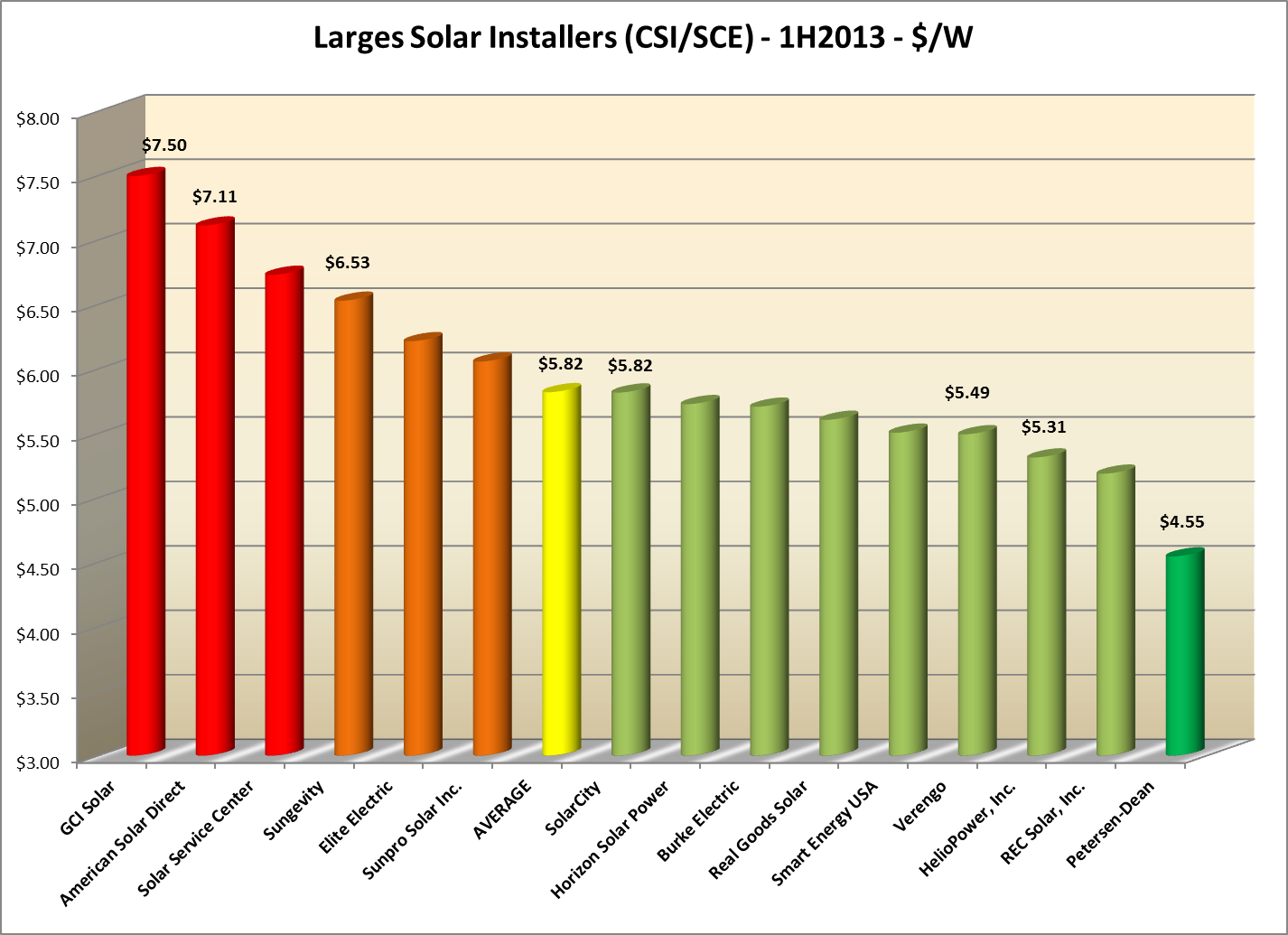 Reducing our sample size in this way brought the number of projects down to 8,555 (62.8% of the total), total installed capacity to 45.6 MW (60.2%) and average cost down to $5.82/W. This last point is news since in the past, the average cost for the largest group was actually greater than the overall average. Not this year.
The next thing to notice is that SolarCity - the largest player in this field with 28.9% more projects than their closest competitor, Verengo - now is right smack on average at $5.82/W. It would appear that at least for CSI purposes, their cost data is no longer an outlier (though it may still be Odd - more on that later). However, their smaller competitor Verengo (at least as measured in this data) once again beat them on price.
On the low end of the scale, Petersen-Dean has snagged the crown from two-time low cost leader HelioPower - and they did it by far, being the only company to show a price below $5/W. Nicely done!
True Outliers Strike Again
Which leaves us with the high end. The first thing to note here is that the industry seems to have cleaned up its act a bit from what we had found last year and the year before. According to the data, the highest price charged has dropped from $13.32 in 2011 (49% above the 2011 average of $8.91) to $10.50 in 2012 (45% above the average of $7.23) to our present $7.50 (29% above our average today of $5.82). So the data has really flattened out and our extremes just aren’t as extreme any more.
And yet, if relatively tiny Run on Sun, with no economy of scale going for it, can bring our projects in at $4.78/W, what is the possible justification for charging, on average, and over hundreds of installs, a price that is more than 50% higher than ours?
CSI’s cost cap as of today is $7.10/W for the Residential program. That means that two companies, GCI Solar and American Solar Direct, are averaging costs that exceed the CSI cap. American Solar Direct is huge - they have 675 projects in the data (ranking them third) accounting for a capacity of 2.6 MW (ranking them fourth). And yet with all of that size - more than twice as many projects as cost leader Petersen-Dean - they are still $1.29 above the average!
And what can we say of GCI Solar? That is the DBA of Killion Energy, Inc. which happens to be located at 15261 Connector Lane in Huntington Beach. But somehow that DBA seemed awfully familiar. And guess what, adjacent to 15261 Connector Lane is 15262 Pipeline Lane which is the home of perennial outlier, Galkos Construction. Could these be one and the same, just with a subtle name change? In the end, it doesn’t really matter - bottom line, $7.50/W is just too much for a large company to be charging.
Caveat emptor.
Not So Fast
Solar companies can also be outliers in ways other than cost - most notoriously, how long do they take to complete their projects. To take a look at that, we limited our data to Residential projects that also showed a First Completed Date in the data. We then averaged the number of days to complete projects as measured by the difference between the First Completed Date and the First New Reservation Request Date. Needless to say, that yields a smaller number of projects, so we lowered our threshold to 500 kW installed for inclusion on our list. Our new “time-to-complete” list includes seventeen companies, 4,865 projects and an installed capacity of 25.9 MW. Surely these folks must have their operational act together, right?
Here’s what we found:
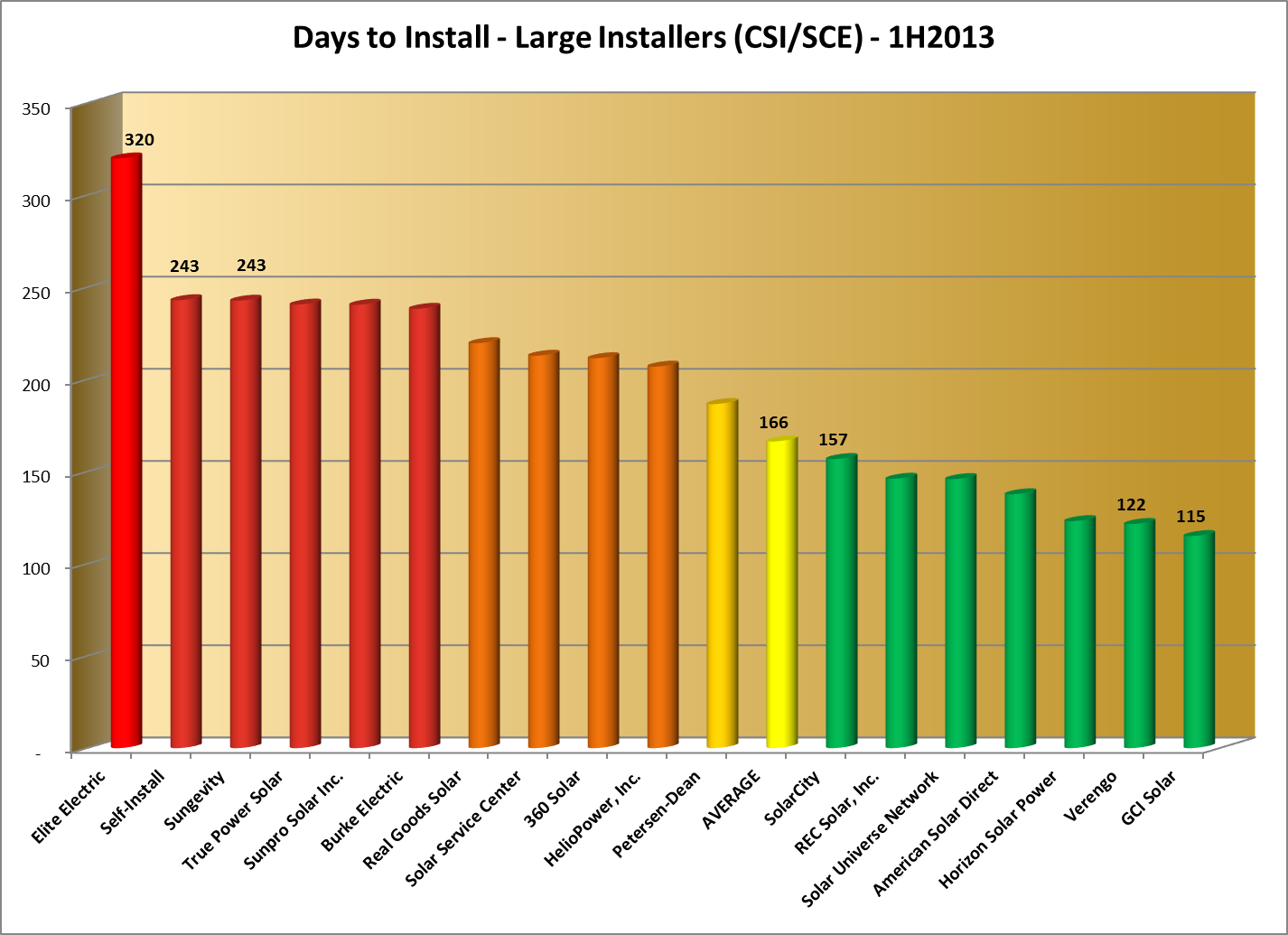 The first thing we note is that, depressingly, the amount of time that it takes on average to get a project completed has gone up - from 157 days last year to 166 days now (a 5.7% increase). We are getting bigger, but as a whole, we are getting slower - not a trend designed to please consumers.
But some companies have improved significantly - most dramatically, SolarCity, going from 212 days last year to just 157 now - a 26% improvement, and comfortably below the overall average. Verengo, which actually has more completed projects in this data than does SolarCity, also improved from 134 days last year to 122 this year. One surprise - GCI Solar, our most expensive installer, was also the fastest of any of these companies to complete a project, taking just 115 days on average.
And then there is Elite Electric. Frankly we have no idea what is going on here but 320 days, on average, to complete a project is just plain crazy.
Last year we derived a somewhat novel metric for looking more closely at the impact of delay times in the overall industry. We called it System-Years of Delay, or SYD, which is the product of the total number of systems installed by a company times their difference in average days to install compared to the overall average, divided by 365. Thus companies that do better than average end up with a positive number, scaled by their impact on the industry in terms of the number of systems they installed, whereas laggards get a negative number, similarly scaled. We see this as an indication of whether a company is propelling the industry forward, or dragging it backward.
Here are our results for the data from this year (some companies that are grouped around the average are omitted for clarity):
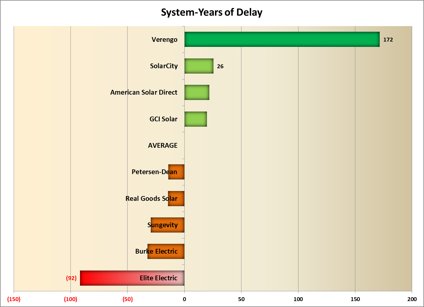 As it did last year, Verengo continues to pull the industry forward and by a wider margin this year than before (172 compared to 111). Last year’s laggard, SolarCity, is now moving things in the right direction. But Sungevity continues to impede progress as do Burke Electric and Elite Electric.
Looking at this another way, assume that a system will produce, on average, 5 kWh/day for every 1 kW installed. Then the delay caused by these laggard companies ends up having real environmental impacts since we are missing out on their energy production for every day that they are completed beyond the overall average. Collectively, that amounts to more than 3 GWh of clean energy that were not produced and an additional 997 tons of CO2 emitted into the atmosphere.
Oddities
Which brings us to the Oddities section of this post.
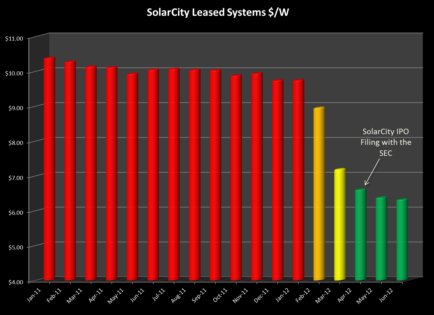
In the past two years we found something really odd in how SolarCity was pricing its systems, at least as it was reported in CSI data. We had noted back in 2011 that SolarCity’s price for its leased systems was far, far beyond the price it was citing for purchased systems, and far beyond what its competitor, Verengo was reporting. Then last year we discovered that the two competitors were now charging exactly the same thing for leased systems and that meant that SolarCity’s price had plummeted in just a short time. Going back and looking at all projects across the state resulted in this, rather startling graph:
 So now that SolarCity’s IPO has come and gone, what are they - and Verengo - charging for leased systems? (We are excluding sold systems because they are really a de minimus share of either company’s business.) Here’s the cost data for installed, Residential projects, along with linear trend lines:
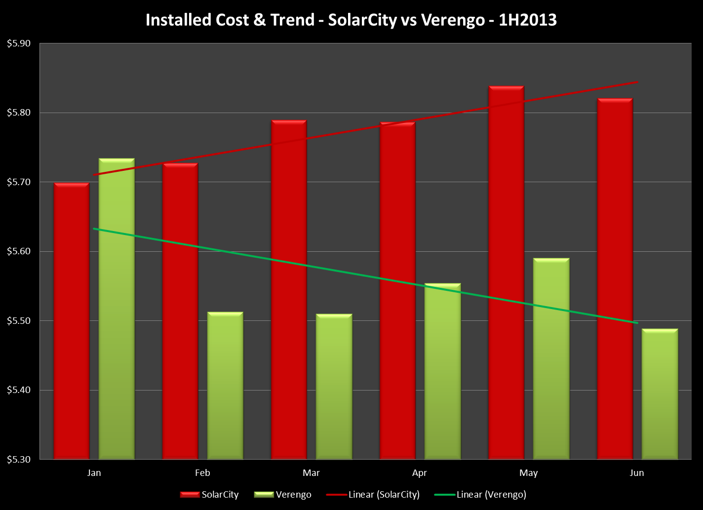 Interestingly, at the beginning of the year, SolarCity was actually reporting a lower cost than was Verengo. But as the year has gone on, SolarCity’s cost has crept upward - not by a lot, but the trend upward is clear. In contrast, Verengo’s costs have come down and their trend is equally clear.
Once again, Verengo follows a trajectory that mirrors the rest of the industry, while SolarCity pursues a course uniquely its own. Perhaps that is no longer odd, but to be expected.
PsomasFMG Rules the Delist
Finally, we return to the strange case of that Ruler of the Delist - PsomasFMG.
In Part 1 we wrote about delisted projects. One company, PsomasFMG, LLC, had an astounding 79% of all of its projects end up being cancelled and thus ended up being “Delisted". That’s 33 projects with a total capacity of 8.6 MW - or more than 260 kW apiece. We thought that this was odd indeed and decided to look a little more closely at what was going on here. (H/T Imogen!)
Of the 33 delisted projects, all of their rebate applications were submitted in a four day window between January 25 and 29, 2013. All but one of those projects were submitted under rebate step 8b; the last one, on the 29th, missed the cutoff and fell to step 9b (it was later withdrawn). The 32 projects submitted under the higher rebate rate were apparently for Government entities in the cities of Pomona (29) and Diamond Bar (3). (We have searched for news accounts announcing those projects but so far have turned up nothing.)
All 32 of these projects submitted under rebate step 8b were cancelled by SCE for failure to pay the CSI-mandated application fee by the due date. Under the CSI Guidelines, non-residential projects that are larger than 10 kW are required to pay an application fee, based on the size of the project, to secure their rebate reservation (see section 4.4.1.1). Thus, to secure rebate reservations for these 32 projects that PsomasFMG submitted, they or their customers would have had to pony up $250,000 within 30 days of submitting the initial application. The rebate reservations at issue here were worth nearly $3.9 million - which sounds like a pretty good investment: pay out $250,000 to secure $3.9 million. But it never happened, and the applications were all cancelled.
So while we know why the applications became delisted - failure to pay the rebate application fee by the deadline - we still do not know why the company was submitting so many applications in such a narrow window of time that all ended up being cancelled. Odd indeed.
08/02/13
Categories: Solar Economics, Commercial Solar, Residential Solar, Ranting, 2013
State of SoCal Solar 2013 - Part 1: Methodology & Trends
Today is our first of three posts looking at the state of solar in Southern California for the first half of 2013 as revealed by the data compiled for the California Solar Initiative (CSI). This first post explains our methodology and highlights some interesting trends in the data.
Methodology
Let’s start with our methodology. The CSI collects a significant amount of data as part of managing its rebate program and most, though not all, of that data is made available to the public. For example, while CSI collects data from installers that identify four components of system cost - solar modules, inverters, permitting and everything else - the data that is made available rolls all of that up into just one number - Total Cost. Nevertheless, the CSI data is the most comprehensive data set available and covers all projects being built in the service areas of California’s three investor-owned utilities: PG&E, SCE and SDG&E.
For our analysis, we started with the CSI Working Data set from July 31, 2013. (Here’s a link to the CSI Working Data download page and here’s a link to the data set (11 MB zip file) that we used for this analysis.) This analysis just looks at data from the SCE service area and to limit our time period to just the first half of this year, we added a Status Date field to the data which is the latest of a series of milestone dates recorded in the data (from First Reservation Date to First Completed Date). We then extracted our data for dates from 1/1/2013 to 6/30/2013. After that it is a matter of pivot table magic!
One other note - there are multiple ways to identify the size of a project from the data: Nameplate Rating (i.e., DC Watts), CEC PTC Rating (which accounts for the PTC rating of the solar modules used times the efficiency of the inverters chosen) and CSI Rating (which applies the Design Factor to the CEC PTC Rating and which is the basis for rebate payments. For the most part, unless otherwise noted, we will be using CEC PTC Rating for system size since that accounts for some measure of equipment quality but isn’t confounded by site complications such as shading or the use of tracking systems. In particular, our $/W figures are computed this way.
Trends
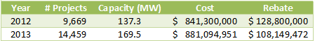
Overall, our data set reflects 14,459 projects, up from 9,669 over the same period last year - an increase of 49.5%.
There are three program divisions in the data: Residential (projects under 10kW), Commercial (projects greater than or equal to 10 kW) and the Multifamily Affordable Solar Housing (MASH). The overwhelming majority of these projects are in the Residential program: 14,028 (97% of the total) are Residential, followed by 387 (2.7%) Commercial and just 44 MASH projects. However, MASH projects are generally associated with affordable housing developments and so they can be quite large overall. In fact, the average MASH project is 158.7 kW, compared to just 5.6 kW for Residential and 216.3 kW for Commercial. Altogether, Commercial projects account for 83.7 MW, followed by 78.8 MW in the Residential program with just 7.0 MW in the MASH program.
Compared to last year, which saw a decline in the amount of solar capacity in the data, capacity this year is up 59% over last year:
At the same time, the average system size continues to decline from 14.2 kW in 2012 to just 11.7 kW this year. Likewise, rebates are falling (by 32%) but so are overall prices (15.2%), just not as fast.
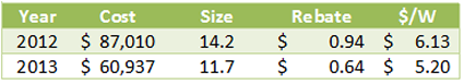
Still, in raw dollars, the reduction in system price of $0.97/W from a year ago, nearly triples the decline in rebate rate.
We will have lots more to say about system costs in subsequent posts.
The pace of projects is accelerating, driven by dramatic growth in the Residential program (as always, click on the chart to see it full size):
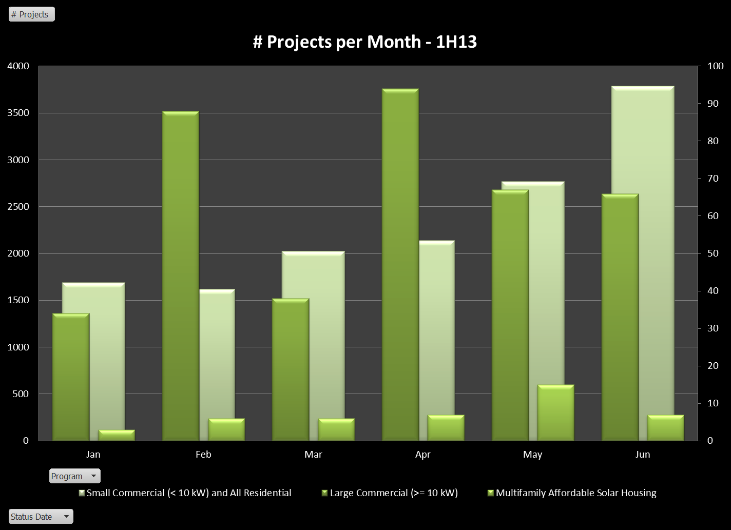 (To make the Commercial and MASH projects visible we have put them on a second axis.) Residential projects have grown from less than 1,700 in January to nearly 3,800 in June!
MASH-Up
Since it is a relatively small slice of the pie we are going to generally ignore the MASH program but before we leave it aside, we thought we should at least take a peak at who are the players in this program. Here’s what we found:
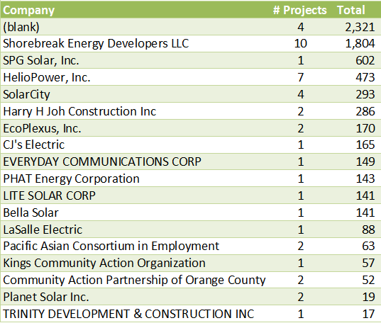
Four projects have no solar contractor associated with them in the data (curious). The big winner, however, is Shorebreak Energy Developers - not a company on our radar, but obviously a major player with nearly 2 MW worth of projects in the program. A few familiar names - HelioPower, SolarCity and even our friends down the road at PHAT Energy (well done, Philippe!).
Roughly half of these projects are third-party owned: 24 of the 44 for a total of 3.5 MW out of a total 6.98 MW. The average cost per CEC PTC Watt is also almost identical, $5.52 for third-party owned versus $5.55 for sold systems. Yet within that average was a very significant range from a high of $13.12 for the 141 kW project being built by Lite Solar, all the way down to $4.32 for the 601 kW project being built by SPG Solar. Shorebreak, the leader in the amount being installed and total number of projects is also a leader on price, coming in at $4.90.
Making the Delist
One stat we continue to find intriguing is the number of delisted projects - projects that got entered into the data but then cancelled at some point. Altogether, there are 471 projects delisted, or just 3.26% of the total, down from 4.2% last year. Those delisted projects accounted for 16.8 MW of capacity or 9.9%, which is up significantly from last year. In other words, fewer projects were delisted, but they accounted for a bigger piece of the potential installed capacity. The majority of the delisted projects, 324 of them (68.8%) were third-party owned.
149 different companies made their way onto the Delist - not surprising for very large players, but as before we decided to look at these companies as a share of their overall project total. We limited to companies with at least 10 delisted projects and then rank ordered them by the percentage of their projects that are delisted. Here they are:
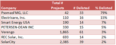 What is up with this? PsomasFMG has 79% of its total projects delisted? Turns out their 33 delisted projects account for nearly half the the total delisted projects by capacity. Not surprisingly, these are all third-party owned Commercial projects ranging in size from 61 kW to just under 1 MW.
The other big winners, Electricare, Smart Energy, and Petersen-Dean had all of their delisted projects in the Residential program with sizes ranging from under 3 kW to just under 10 kW. Interestingly, of the worst actors last year: Remodel USA, Herca Solar and A1 Solar Power, both A1 Solar (4 projects) and Remodel USA (1) still made the delist this go around, but with greatly improved numbers. (Herca Solar has 44 projects overall in the data, none delisted.)
While Commercial projects are necessarily more complex, making cancellations more likely, it is hard to understand a 15% delist rate for Residential projects. Caveat emptor.
Does Size Matter?
Finally, we turn to the question of size, and in particular how well does the size of a project drive down its cost? For this analysis (and most of our analyses going forward) we are excluding delisted and wait list projects from our data. Here’s our result for systems at or below 10 kW:
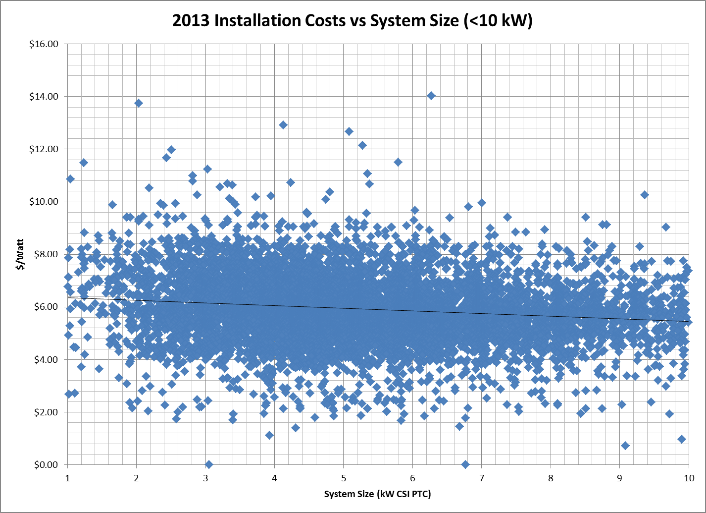 As in the past, we had to exclude a couple of outliers above $15/Watt: the farthest out there was Sun Pacific Solar Electric which charged $21/W for a 1.5 kW system and right behind was California Solar who installed a 7.9 kW project for over $16/W! We will have lots more to say about such Outliers next week.
Overall, the trend is clearly moving in the system buyer’s direction with the trend line reaching down to $5.40/W for systems sized at 10 kW, while a typical residential project of 5 kW comes in around $5.70/W.
Nevertheless, that is a very gradual slope indicating that prices are fairly consistent across system sizes in this program segment.
What about larger systems, do we see more of a downward trend there as system sizes increase? Here’s the data:
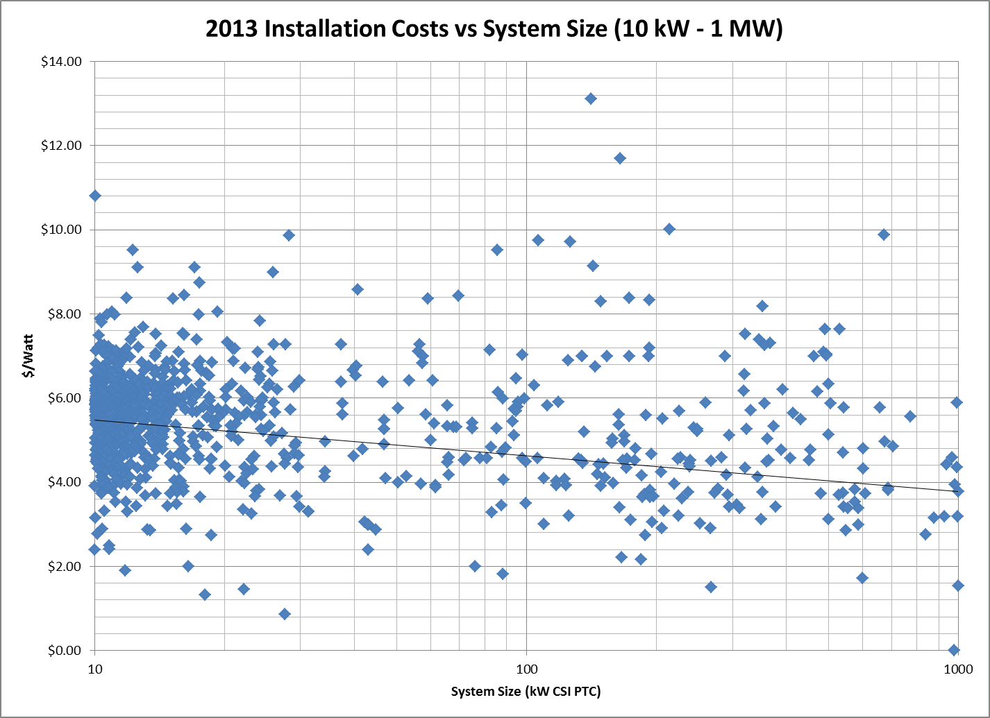 Interestingly, for the smaller projects there is very tight clustering right around the $5.70 mark where the trend line begins. However, as you move up in system size, the clustering breaks down and system costs vary far more widely than they do for smaller systems. Still the trend has 1 MW projects coming in around $3.77/W, compared to nearly $5.20 last year.
Ok, that’s enough to get us started. Monday we will report on Who’s Hot and Who’s Not, and Tuesday will be our favorite post: Outliers and Oddities. Stay tuned!
05/31/13
Categories: Solar News, Commercial Solar, Safety, Ranting
Does Quality Sell?
Nothing like a piece in the New York Times questioning the reliability of some solar modules to get tongues wagging and some pointing fingers at “Chinese dumping” while others tell us that solar technology is just not ready for prime time. To us it raises a different question - does quality sell?
The article, titled Solar Industry Anxious Over Defective Panels, points to installations as close as the Inland Empire, having shockingly high failure rates after just two years of being installed. “Coatings that protect the panels disintegrated while other defects caused two fires that took the system offline for two years, costing hundreds of thousands of dollars in lost revenues.” Wow - that is shocking. So who made those defective panels? The reporter doesn’t say.
Nor are any of the problem panels alluded to in this story ever named, citing, in some cases, confidentiality agreements.
Which raises a serious problem with the article: if you cannot identify any of the solar module manufacturers that are having these problems you leave the impression that all solar modules are suspect. (Our analysis on who the guilty party might be is below…)
A quick perusal of the comments to the article reveals the predictable factions: those who echo the Fox News line that solar is a failed technology that only exists because of the Obama Administration’s foolish indulgence in Green Tech; claims that all problems in the solar industry are a result of “Chinese dumping” and the associated China bashing; countered partially by a handful of comments from people who actually know something about the industry.
We find the Chinese bashing particularly problematic - after all, the Chinese are not putting a gun to any project developer’s head and forcing them to use third-tier panels.
Greed is what is causing that.
We have been in business since 2006 and there have always been high quality solar panels available from reputable manufacturers - and they have always cost more than many of the panels offered to us for use in our projects. Scanning the CSI data (see below) reveals that many projects - including many of the largest projects - were built using those “bargain basement” panels. Why? Because it maximized the project developer’s profit.
This is not a new problem, despite it getting a major splash in the “Paper of Record." Indeed, we wrote in the Spring of 2012 about how the decision by project developers to focus on the lowest cost per Watt “will continue to put undue pressure on quality manufacturers around the globe - whether in the US or China. Consumer demand for quality is the ultimate way to improve this situation - and that means educating consumers as to what quality means in this market." A year plus has gone by, but where has that educational effort been? The need is as great - or greater than ever, but sadly, the NY Times piece fails on that score. (If you want to read an earlier, and far more comprehensive article on this subject, check out this piece by the great Felicity Carus: Quality Issues Threaten to Give Solar a Black Eye.)
What’s Up in the Inland Empire?
It’s a Friday morning so we decided to indulge in one of our favorite pastimes and go diving into the CSI data to see if we could identify the guilty party alluded to in the NY Times piece. Here is all they gave us to go on - the project has been in place for roughly four or more years (failed after 2 years, offline for 2 years), located in the “Inland Empire” and its downtime resulted in a loss of “hundreds of thousands of dollars” in revenue. From that we concluded that we needed to look at systems from 2010 or earlier, in the Inland Empire - which we took to mean anywhere in the counties of Riverside or San Bernardino - and of at least 200 kW. Those criteria provide us with 28 potential systems, built with solar panels from just seven manufacturers. Here are our results:
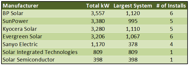
What can we say about these manufacturers? Well, certainly BP Solar, SunPower, Kyocera and Sanyo would all be considered top-tier manufacturers of solar panels - although BP is exiting the solar industry and Sanyo is now owned by Panasonic.
As for the others, Evergreen Solar was a US manufacturer that filed for bankruptcy in August 2011. Solar Integrated Technologies was a subsidiary of Michigan-based Energy Conversion Devices which itself filed for bankruptcy in February 2012. Solar Semiconductor is a vertically integrated systems provider with manufacturing facilities in India.
So who is the guilty party? No way to know for sure, but a little online searching reveals other problems for one of these companies. A September 14, 2012 article on the San Diego Union Tribune website documents problems with “Flawed Solar Panels” that were manufactured by Solar Integrated Technologies. According to the article, the panels manufactured by the company, “had a manufacturing defect that allowed water to seep into crevices of the panels, which in some cases created corrosion and in the worst-case scenario could cause a short that could start rooftop fires” - which sounds a great deal like the problem cited in the New York Times piece.